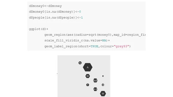
Creating Static SVGs from GeoJSON
A technical guide on converting GeoJSON map data into static SVG files using D3.js to reduce JavaScript payload and enable simple interactivity.
OpenStreetMap now hosts vector tiles, enabling dynamic styling and sharper maps. This article explores how to visualize and analyze the new format.
A statistical analysis of a classic 1986 dataset, demonstrating how modern displays make hidden structures visible without complex methods.
A comprehensive guide to building interactive data applications using the Streamlit framework, covering setup, visualization, ML integration, and deployment.
An animated exploration of UMAP, a state-of-the-art dimensionality reduction algorithm, applied to the classic MNIST dataset of handwritten digits.
A technical analysis using R and the DHBins package to visualize New Zealand's National Land Transport Plan expenditure data via hexmaps.
A technical tutorial on creating interactive data tables by web-scraping with R's rvest package and styling with reactable.
A tutorial on creating interactive, production-grade tables in R using the reactable and reactablefmtr packages.
A tutorial on creating calendar heatmap plots using ggplot2 in R to visualize time-series data like flight frequencies.
A tutorial on advanced text styling in R's ggplot2, including dynamic color adjustment and using the new {marquee} package for markdown formatting.
A tutorial on using Plotnine, a Python data visualization library based on the grammar of graphics, comparing it to ggplot2 and using Polars.
A tutorial on enhancing line charts using ggplot in R, covering themes, colors, labels, and direct labeling techniques.
A technical guide explaining why ggplot2 line charts sometimes appear blank and how to fix the issue, focusing on data structure and grouping.
Explains a crucial flaw in using boxplots for data visualization and suggests better alternatives.
HeavyIQ is an AI-powered English-to-SQL interface from HEAVY.AI, using a fine-tuned LLM to query and visualize massive datasets like flight records.
Using R and geospatial data to calculate and compare the proportion of coastline to land borders for US states, with Rhode Island as a key example.
A tutorial using custom animations to visually explain how dplyr's mutate(), summarize(), group_by(), and ungroup() functions work in R.
A data visualization expert details their participation in the #30DayChartChallenge, using DataWrapper to create interactive charts based on 'The Simpsons' data.
A review of an online data visualization fundamentals workshop led by expert Andy Kirk, covering analysis, chart selection, and practical exercises.
A developer discusses designing an inclusive SaaS dashboard, focusing on color blindness accessibility and user experience principles.