Inside the Sausage Factory: How we Built the Program for Current 2022
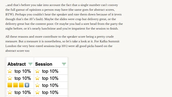
A behind-the-scenes look at how the program committee used data and tools to select talks for the Current 2022 and Kafka Summit tech conferences.
A security engineer shares key lessons and query patterns learned from a year-long #365daysofKQL challenge, focusing on threat hunting and log analysis.
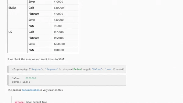
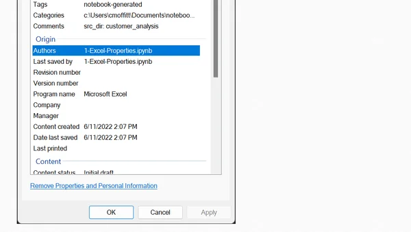
A guide to embedding source notebook metadata in Excel reports using Python's pandas and xlsxwriter to simplify tracking and refreshing analyses.
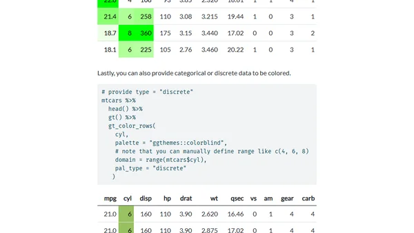
Introducing gtExtras, an R package for creating beautiful, functional tables with opinionated themes and inline graphics.
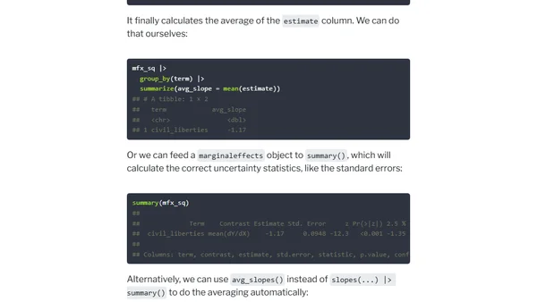
A guide explaining marginal effects in regression analysis, including definitions and differences between types like average marginal effects, using R packages.
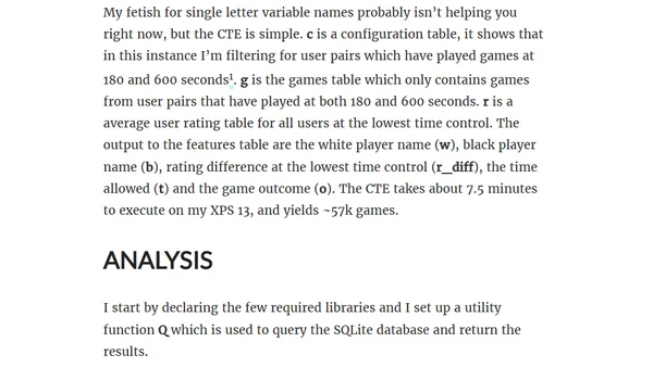
Analyzing chess game data from lichess.org to determine if fast thinking is the dominant factor in game outcomes across different time controls.
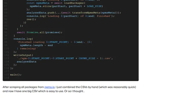
Analyzes if NPM package popularity correlates with quality using data from npms.io, finding it can be an indicator but not a guarantee.
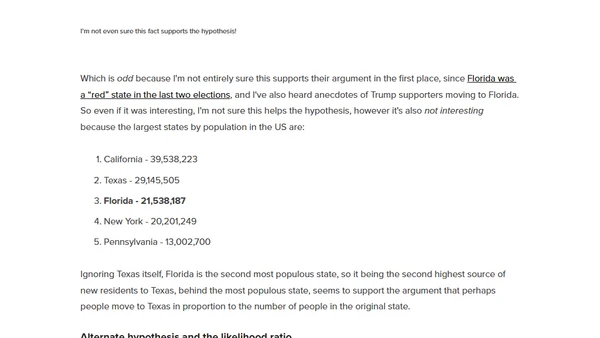
Explains how to apply Bayesian thinking and probability to critically analyze news articles and identify underlying biases.
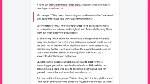
A developer's critique of Twitter's algorithmic Home feed, explaining why it failed to show relevant tech content and seeking alternatives.
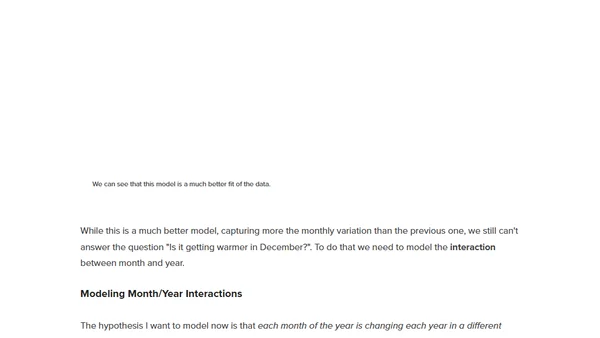
A data scientist uses NOAA data and statistical modeling to analyze if December temperatures in New Jersey are truly warming over time.
An overview of the Pandas library for data analysis, covering data reading, filtering, merging, and visualization.
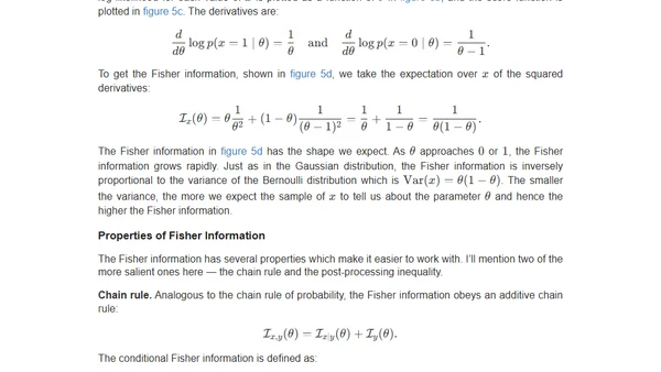
An introduction to Fisher Information, a statistical concept that quantifies how much information data samples contain about unknown distribution parameters.
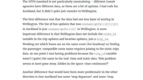
A developer analyzes Wellington's public transport data using GTFS feeds, comparing it to Auckland and building tools to track bus delays and cancellations.
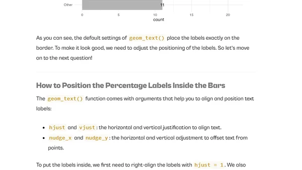
A tutorial on creating and customizing bar charts in ggplot2, focusing on adding percentage labels, custom colors, and improving accessibility.
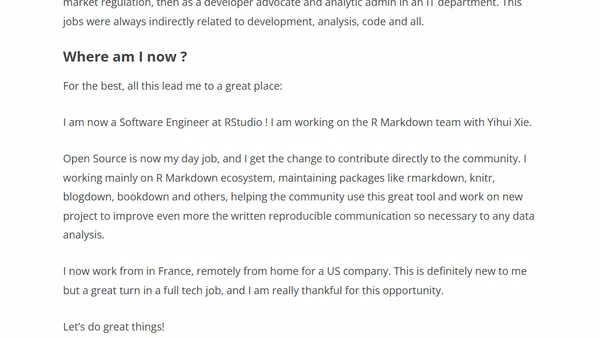
A personal blog by an RStudio software engineer sharing findings, tips, and experiences with the R programming language and its ecosystem.
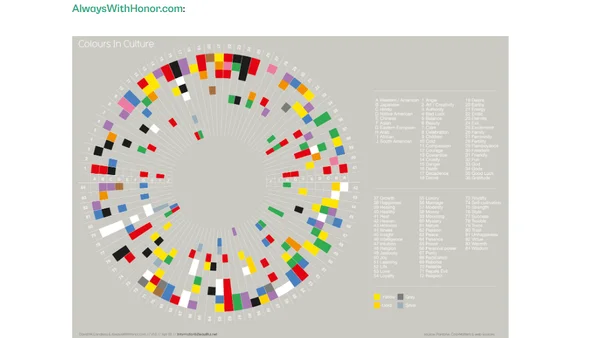
Explores how color choices in data visualizations evoke emotions and influence interpretation, using temperature charts as an example.
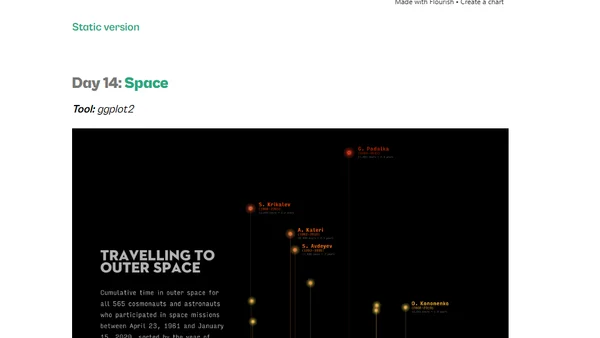
A data scientist shares her experience and contributions to the #30DayChartChallenge, a data visualization event, using various tools like ggplot2, PowerPoint, and Figma.
A product manager discusses five essential skills for product and leadership roles: SQL, Excel, clear communication, storytelling, and prioritization.
A guide to using SQL for efficient data analysis, comparing performance with pandas and demonstrating advanced SQL techniques.
A Kusto query snippet for Azure Log Analytics to filter records from the last 7 days, showing only entries between 9am and 5pm in local time.