A Quick How-to on Labelling Bar Graphs in ggplot2
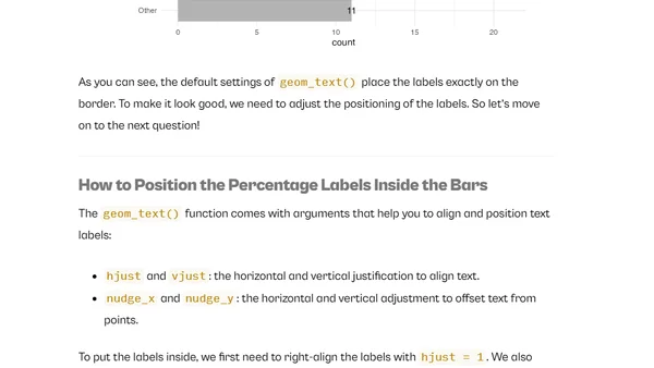
Read OriginalThis article provides a step-by-step guide to enhancing bar charts in R's ggplot2 package. It covers data preparation with tidyverse tools, calculating percentages, positioning labels inside bars, applying custom colors, and improving chart accessibility. The tutorial uses the built-in 'mpg' dataset as a practical example for creating professional, publication-ready visualizations.

Comments
No comments yet
Be the first to share your thoughts!
Browser Extension
Get instant access to AllDevBlogs from your browser
Top of the Week
No top articles yet