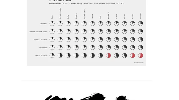
Best TidyTuesday 2019
A review of the best #TidyTuesday data visualization submissions from 2019, highlighting creative and insightful uses of R and ggplot2.

A review of the best #TidyTuesday data visualization submissions from 2019, highlighting creative and insightful uses of R and ggplot2.
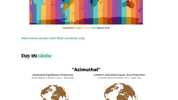
A developer's experience and technical learnings from participating in the 30DayMapChallenge, creating maps using R and geospatial tools.
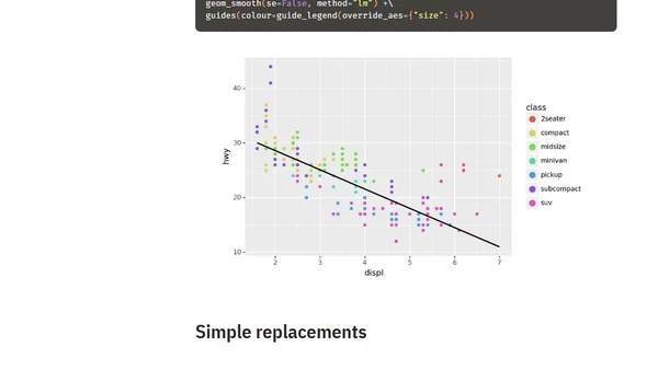
A guide with practical heuristics for converting ggplot2 (R) visualization code to plotnine (Python) code, including syntax and style differences.
A tutorial on using Plotnine, a Python data visualization library based on the grammar of graphics, translated from the ggplot2 R tutorial.
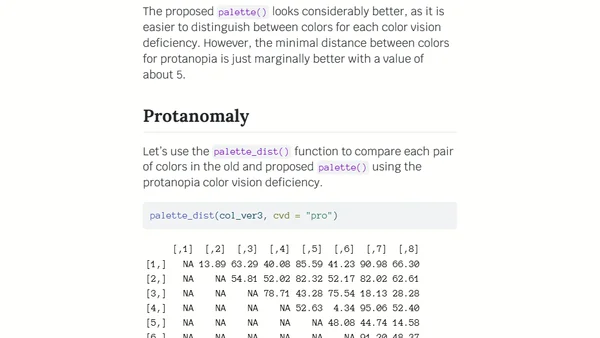
Analysis of R 4.0's new default color palette, testing its accessibility for color vision deficiencies using the colorblindcheck package.
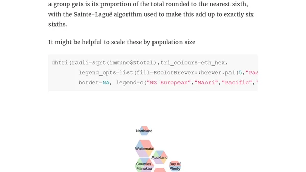
A technical tutorial on creating hexagon maps (hexmaps) for visualizing New Zealand District Health Board data using the R programming language and the DHBins package.

A case study on implementing accessible data visualizations using SVG for the Khan Academy 2018 Annual Report website.
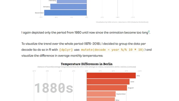
A tutorial on creating animated bar chart races in R using gganimate, applied to visualize historical temperature trends in Berlin.
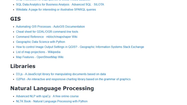
A curated list of free resources for data mining, analysis, and visualization, including books, tools, libraries, and tutorials.
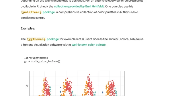
A comprehensive tutorial on creating beautiful and customizable data visualizations using the ggplot2 package in R, covering syntax, themes, and advanced techniques.
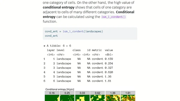
Explains how information theory and R code can quantify and classify spatial patterns, with examples from landscape ecology.
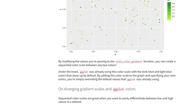
A guide to mastering custom color palettes in ggplot for R, covering static colors, variable mapping, and gradient/ manual scales.

A personal request for help finding a short-term sublet in NYC after a last-minute cancellation.
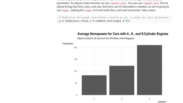
A tutorial on improving ggplot graph readability and visual appeal by rotating axis text, using R and tidyverse.
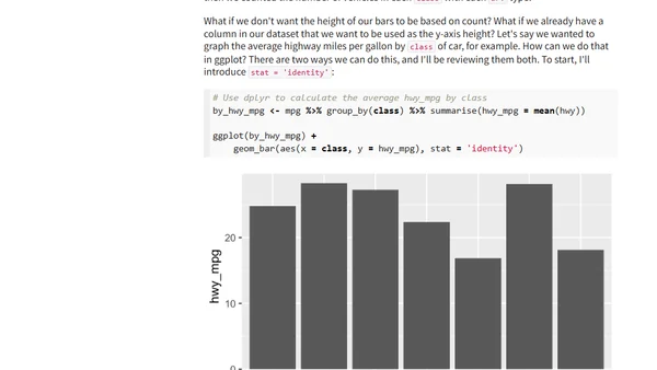
A tutorial on creating bar charts in R using the ggplot2 package, covering the basics of the geom_bar function and data visualization principles.
A guide on how to extract your personal run data from the Nike Run Club app using a bash script and visualize it with Python.
An analysis of user-created Sankey diagrams from Reddit, visualizing personal Tinder match data and dating outcomes.
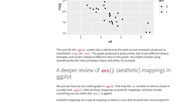
A tutorial on creating and customizing scatter plots using the ggplot2 package in R for data visualization.
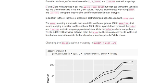
A tutorial on creating line graphs in R using the ggplot2 package's geom_line function, with examples using the built-in Orange dataset.
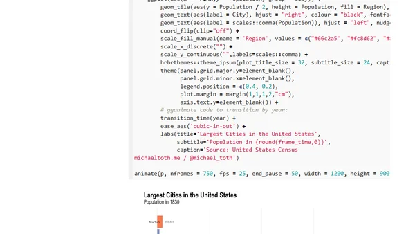
A tutorial on creating an animated bar chart race in R to visualize the changing population rankings of US cities from 1790 to 2010.