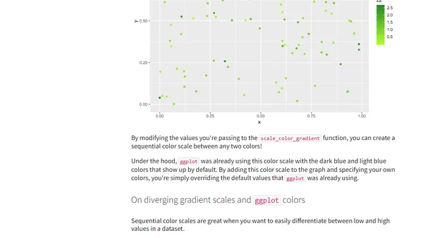
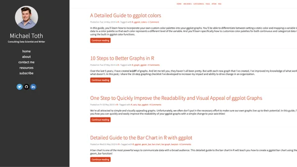
A Detailed Guide to ggplot colors
A guide to mastering custom color palettes in ggplot for R, covering static colors, variable mapping, and gradient/ manual scales.
Michael Toth is a consulting data scientist and writer known for clear, practical guides to data visualization in R. His work focuses on ggplot, effective graph design, and helping data scientists communicate insights with impact.
20 articles from this blog
A guide to mastering custom color palettes in ggplot for R, covering static colors, variable mapping, and gradient/ manual scales.
A tutorial on improving ggplot graph readability and visual appeal by rotating axis text, using R and tidyverse.
A tutorial on creating bar charts in R using the ggplot2 package, covering the basics of the geom_bar function and data visualization principles.
A data scientist shares a personal job search story to argue that landing a tech job is about skill alignment, not just mass-applying.
A tutorial on creating and customizing scatter plots using the ggplot2 package in R for data visualization.
A data scientist discusses the importance of a business mindset, prioritization, and effective communication for creating real-world value in data science projects.
A data scientist explains their method for crowdsourcing and ranking 41 data science podcasts by analyzing Google search results.
A tutorial on creating line graphs in R using the ggplot2 package's geom_line function, with examples using the built-in Orange dataset.
Analysis of 2019 Stack Overflow survey data comparing global and US salaries for R vs. Python programmers and data professionals.
Blog author offers free 45-minute one-on-one R training sessions to 10 people, focusing on data analysis, visualization, and package development.
A guide to understanding and using R's date format functions like as.Date(), as.POSIXct(), strftime(), and strptime() for data manipulation.
A tutorial on using the dplyr filter() function in R for data wrangling, focusing on selecting rows based on criteria.
A tutorial on creating an animated bar chart race in R to visualize the changing population rankings of US cities from 1790 to 2010.
A guide on how to customize ggplot graphs to match your company's visual branding, making your data visualizations stand out and be more impactful.
A guide to integrating RMarkdown with the Pelican static site generator using a custom R script to avoid plugin conflicts.
A technical analysis using sentiment analysis on Warren Buffett's shareholder letters from 1977-2016 to identify trends in tone and market influence.
A guide to configuring a Pelican blog to publish posts directly from RMarkdown files using the rmd_reader plugin and knitr.
A technical guide on compiling and installing Shiny Server from source on a 32-bit Ubuntu system, including dependency setup and troubleshooting.
A tutorial on using R's dbWriteTable function to efficiently write a data frame to a temporary SQL table for database queries.
A developer explains implementing a percolation system visualization in JavaScript, covering the Union-Find algorithm and project challenges.