Visualizing Temperatures in Berlin with Bar Chart Races
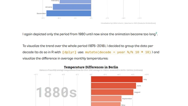
Read OriginalThis technical article details how to create bar chart race animations in R using the gganimate package. It walks through the process of visualizing Berlin weather data, including monthly maximum temperatures and deviations from historical averages, demonstrating data manipulation with dplyr and the use of color palettes like viridis and scico.

Comments
No comments yet
Be the first to share your thoughts!
Browser Extension
Get instant access to AllDevBlogs from your browser
Top of the Week
No top articles yet