One Step to Quickly Improve the Readability and Visual Appeal of ggplot Graphs
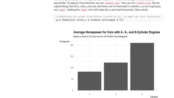
Read OriginalThis article provides a technical tutorial for R users on enhancing ggplot2 graphs. It focuses on improving clarity, simplicity, and visual appeal, specifically demonstrating how rotating axis text can make bar charts more readable. The guide includes code examples using the tidyverse and hrbrthemes packages with the mtcars dataset.
Comments
No comments yet
Be the first to share your thoughts!
Browser Extension
Get instant access to AllDevBlogs from your browser
Top of the Week
No top articles yet