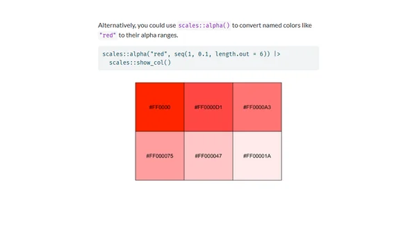
Housing unaffordability hexmaps
A technical analysis comparing traditional maps to hexmap visualizations for New Zealand housing affordability data using R and ggplot2.
Explores how color choices in data visualizations evoke emotions and influence interpretation, using temperature charts as an example.
A tutorial on creating Raincloud Plots, a hybrid data visualization combining box plots, violin plots, and raw data points, using ggplot2 in R.
A review of Python tools and libraries for visualizing and interactively exploring Pandas DataFrames, comparing them to Excel's graphical interface.
A data visualization designer reflects on their 2020 freelance work, challenge contributions, and personal projects using R, ggplot2, and plotly.
A data visualization project analyzing IMDb's top 250 TV shows using R, focusing on rating trends and episode details.
A personal perspective on red-green color blindness (deuteranopia), explaining how it actually works and its impact on interpreting digital charts.
A tutorial on using NumPy for numerical arrays and Matplotlib for data visualization in Python, aimed at scientific computing and machine learning.
A guide on selecting colorblind-friendly bivariate color palettes for data visualization, with examples in R.
A technical guide to calculating sunlight exposure in a garden using solar position algorithms and interactive web tools.
A tutorial on creating interactive 'You Draw' bar charts using the Compost.js library, inspired by NYT's data visualization style.
A step-by-step tutorial on building a bar chart from scratch using D3.js, covering core concepts like SVG, scales, and margins.
Explains the core database-like join semantics (Update, Enter, Exit) in D3.js for binding data to DOM elements.
A developer shares insights and lessons learned from speaking at tech conferences, including idea generation and personal experiences.
A developer's deep-dive into using dataframe.js for data cleaning and visualization, analyzing UN data on unpaid work by gender.
A technical tutorial on mapping COVID-19 cases in New Zealand by District Health Board using R and the DHBins package.
An enterprise architect discusses the challenges of data validation speed, automation, and the essential role of human intuition in ensuring data quality.
A tutorial on integrating the Chart.js JavaScript library with Django to create data visualizations from Django model data.
Announcing heatmaply 1.0.0, an R package for creating interactive, cluster-based heatmaps for online sharing and visualization.
A tutorial on building an interactive data dashboard using R, flexdashboard, and Shiny with data from Google Sheets.