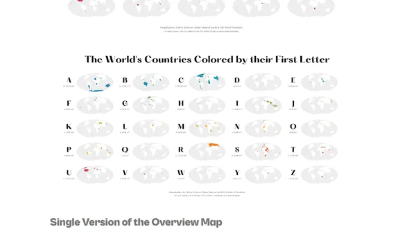
The World's Countries Colored by Their First Letter
Read OriginalThis article details a personal data visualization project that creates choropleth maps colored by the first letter of each country's name. The author explains the motivation, design choices (using small multiples for clarity), data sources (NaturalEarth, CIA World Factbook), and the technical stack including R, ggplot2, dplyr, sf, and other R packages for data preparation and plotting.
Comments
No comments yet
Be the first to share your thoughts!
Browser Extension
Get instant access to AllDevBlogs from your browser
Top of the Week
No top articles yet