NBA Horserace 🏇
A data visualization tutorial using Flourish to create an animated 'horserace' chart tracking NBA team win percentages.
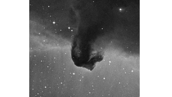
Introducing AstroImages.jl, a Julia package for visualizing astronomical images from FITS files.
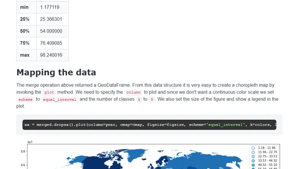
A tutorial on creating a choropleth world map in Python with GeoPandas to visualize global internet usage percentages.
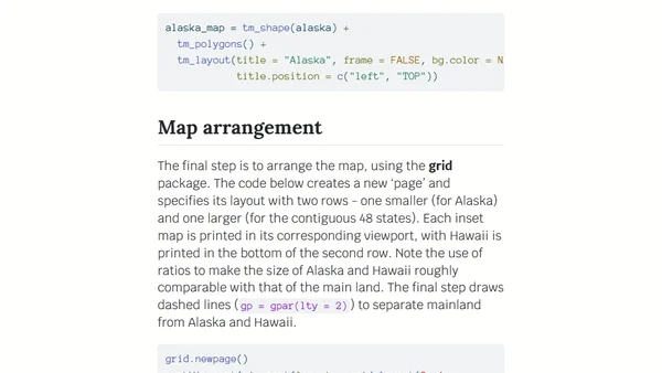
A technical tutorial on creating US maps with R, including Alaska and Hawaii as properly scaled insets using the sf and tmap packages.
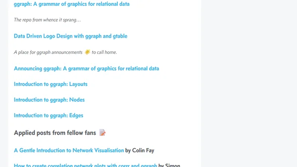
A roundup post celebrating the CRANniversary of the ggraph R package, highlighting its features and community tutorials for network visualization.
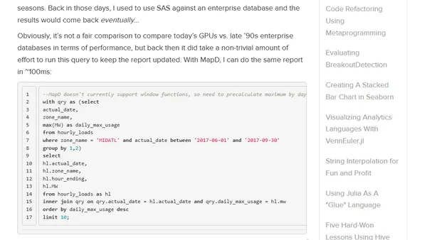
A technical tutorial on using Python and pandas to process electricity data and load it into OmniSci (formerly MapD) for dashboard creation.
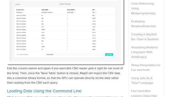
A tutorial on installing OmniSci (formerly MapD) using Docker and loading data for GPU-accelerated SQL analytics and visualization.
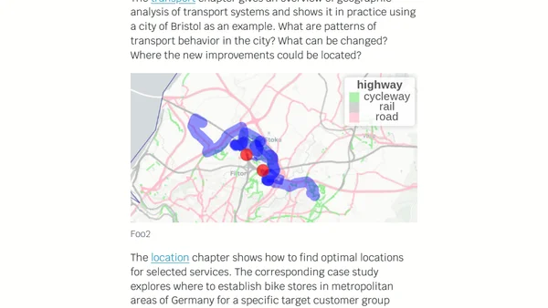
An update on the 'Geocomputation with R' book, covering progress on chapters about spatial data, analysis, and future plans for advanced methods.
A personal selection of the author's favorite conference talks from 2017, covering web development, data visualization, and browser technology.
A data scientist's 2017 year in review, highlighting top R, Python, and data visualization resources and projects shared each month.
Introducing heatmaply, an R package for creating interactive, shareable cluster heatmaps for data visualization and online publishing.
A brief review of Refind, a tool that curates links from tweets into a browsable format for discovering tech articles and resources.
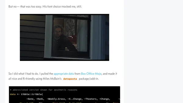
A data scientist explores using the Papyrus font in R and ggplot2, analyzing Avatar box office data with custom visualizations.
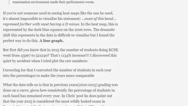
A critique of data visualization choices in a KCSE exam analysis, comparing heat maps to line graphs for clarity.
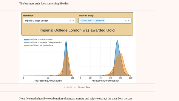
A data exploration app using Dash by Plotly to visualize UK Teaching Excellence Framework (TEF) 2017 scores from a CSV file.
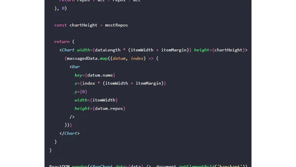
A tutorial on creating custom bar charts in React using SVG components, without relying on external charting libraries.
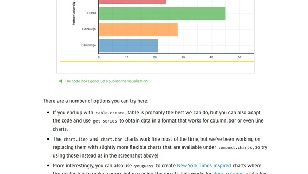
The Gamma project simplifies data visualization creation with a new four-step guide, allowing users to upload CSV data and build interactive charts.
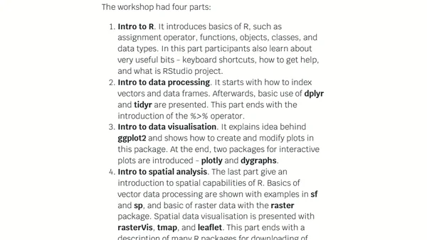
A summary of a two-day workshop introducing R programming, data processing, visualization, and spatial analysis for beginners in geography and GIS.
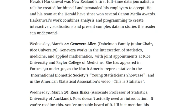
Announcing a public lecture series honoring statistician Ross Ihaka, featuring talks on statistical computing, data visualization, and data journalism.
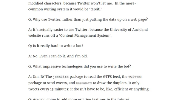
A developer explains their Twitter bot that monitors and visualizes Auckland bus delays using GTFS data and R packages.