

Dual Axis Line Charts in Plotly
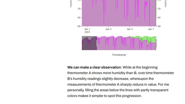
A guide to creating and using interactive dual-axis line charts in Plotly for Python, with examples comparing sensor data.
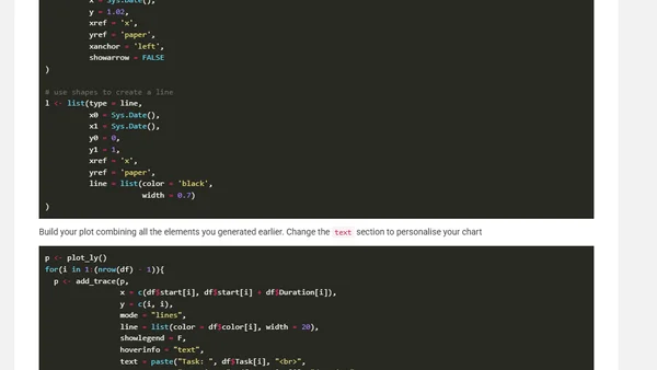
A technical tutorial on using the R plotly package to create interactive Gantt charts for project planning, specifically for a PhD thesis.
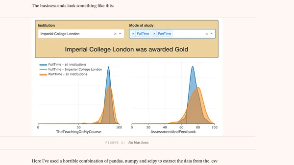
A data exploration app using Dash by Plotly to visualize UK Teaching Excellence Framework (TEF) 2017 scores from a CSV file.