

TEF 2017 Data Exploration App
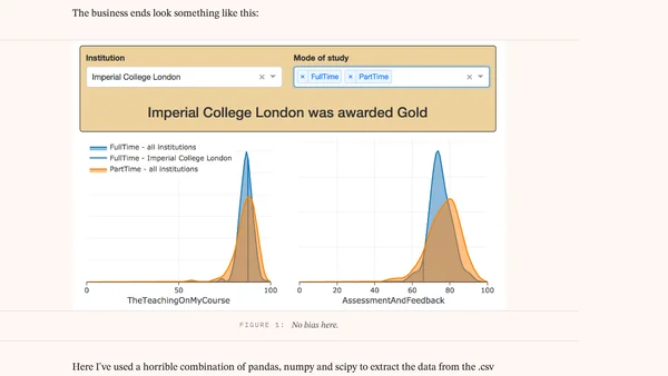
Read OriginalThis article presents a Python-based interactive data visualization app built with Dash by Plotly to explore the UK Teaching Excellence Framework (TEF) 2017 dataset. The author uses pandas, numpy, and scipy to process a CSV file from HEFCE and create kernel density estimates and scatter plots, allowing users to compare institution scores and TEF awards (Gold, Silver, Bronze). The app is hosted on Heroku and demonstrates quick development with Dash, a web framework combining Flask, React.js, and Plotly. The code is available on GitHub. This is a technical tutorial and project showcase relevant to IT/technology, specifically data visualization and web development.
0 comments
Comments
No comments yet
Be the first to share your thoughts!
Browser Extension
Get instant access to AllDevBlogs from your browser
Top of the Week
No top articles yet