The ‘iris’ data
Critique of the classic iris dataset as a misleading example in modern machine learning education, exploring its original scientific purpose.
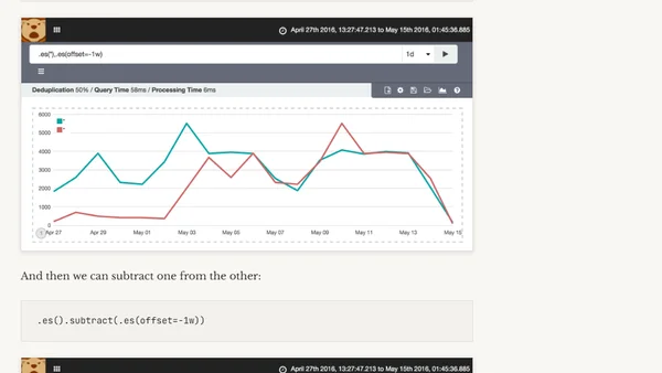
A technical guide on using Kibana Timelion to calculate and visualize the difference between current data and data from one week ago.
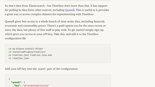
A guide to using Kibana Timelion for time series analysis, covering installation, basic queries, data manipulation, and integrating external data from Quandl.
A guide for academics with math/physics backgrounds transitioning into data science, covering skills, learning paths, and practical advice.
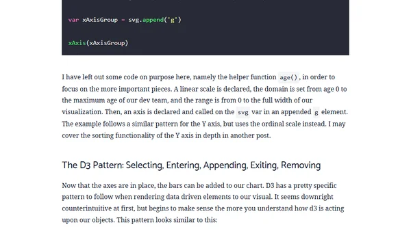
A tutorial on using D3.js to create a reusable bar chart for data visualization, using a sample dataset of team members.
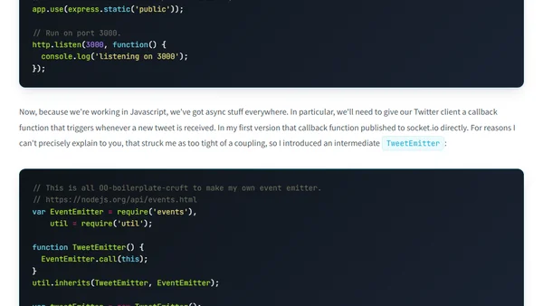
A developer recreates a real-time data visualization, plotting geotagged tweets about Trump on a 3D globe using d3, socket.io, and the Twitter API.
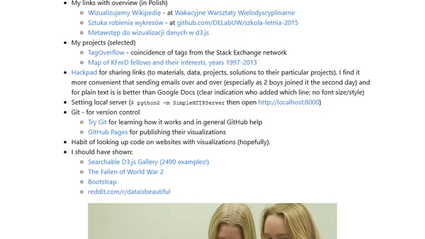
A summary of a D3.js data visualization workshop for gifted high-school students, covering materials and projects.
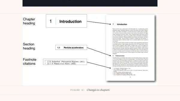
A PhD graduate shares tips and observations on writing a long LaTeX thesis, including visualizations and color analysis.
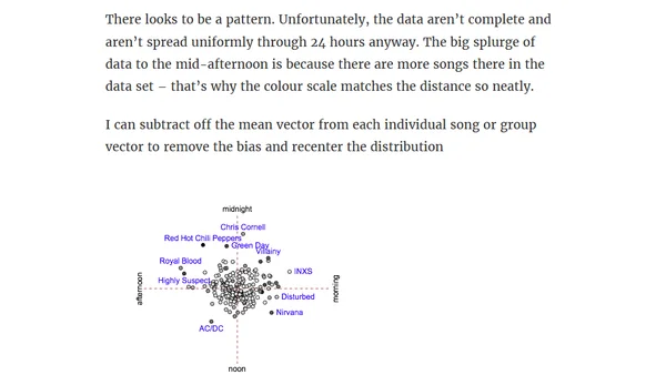
A data analysis of a radio station's song rotation patterns using vector math and statistical methods to test anecdotal claims about repetitive playtimes.
A former PhD scientist shares his positive transition to data science freelancing, detailing the freedom and variety of his new career.
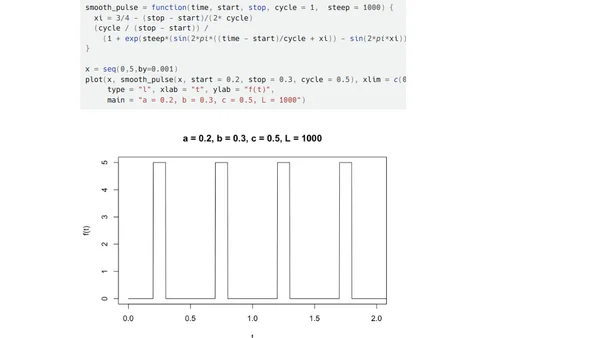
A technical article presenting a mathematical function for creating smooth, differentiable pulses, with R code examples.
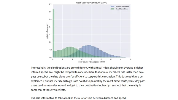
A tutorial on analyzing Seattle's Pronto CycleShare data using Python, Pandas, and the PyData stack for data science.
Video presentation from JuliaCon 2015 on using Julia for data analytics and visualization, featuring a Citi Bike API analysis and the Vega.jl package.
A summary of the second Nilearn sprint, highlighting new features and improvements for this neuroimaging machine learning library.
A developer revives the Vega.jl package for Julia, updating it for v0.4, adding Jupyter Notebook support, and planning new visualizations.
A tutorial on creating reusable D3.js chart components within Angular directives, demonstrating composition with a line chart and scatter plot.
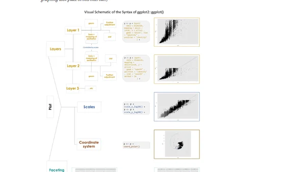
A tutorial introducing the ggplot2 package for data visualization in R, presented at a user group meeting.
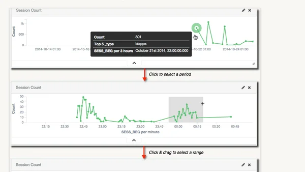
A guide to analyzing Oracle Data Integrator (ODI) runtime performance data using Elasticsearch and Kibana for visualization and trend analysis.
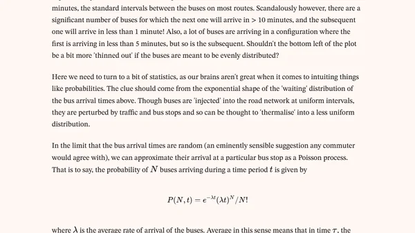
Analysis of London bus arrival times using Python, Matplotlib, and TfL data to test if buses come in pairs.
A tutorial on creating maps using R, based on a presentation by Ryan Peek and Michele Tobias at the Davis R Users' Group.