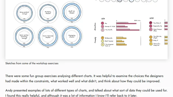
Workshop Review: Data Visualisation Fundamentals with Andy Kirk
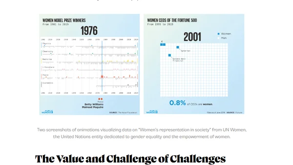
A review of an online data visualization fundamentals workshop led by expert Andy Kirk, covering analysis, chart selection, and practical exercises.
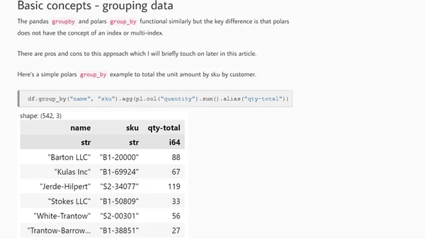
A comparison of Polars and Pandas for data analysis in Python, focusing on Polars' API, performance benefits, and use cases.
Interview with Emanuel Zgraggen, CEO of Einblick, on his career journey and building a visual computing platform for accessible data analysis.
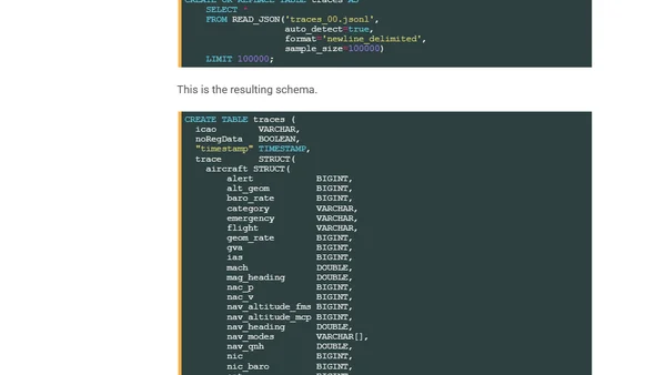
A technical guide on analyzing global flight tracking data from ADS-B receivers using Python, DuckDB, and QGIS.
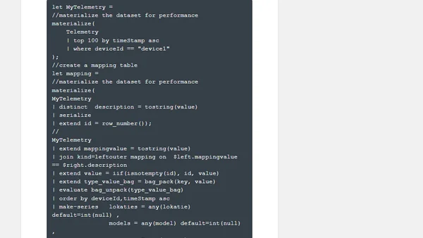
Explores methods for handling Change Data Capture (CDC) patterns from IoT devices within Azure Data Explorer for data analysis.
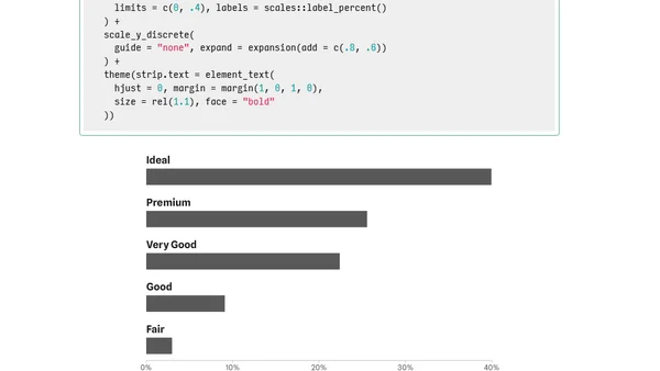
A tutorial on customizing bar chart labels in ggplot2, focusing on placing category labels above bars and styling visualizations.
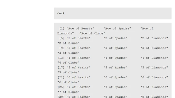
A technical blog post demonstrating how to use R programming to computationally enumerate all possible 5-card poker hands from a standard deck.
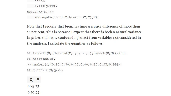
Explores using logic programming (Prolog) for data analysis, demonstrating its application on a diamond pricing dataset to build robust models.
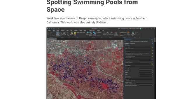
A review of Esri's Spatial Data Science MOOC, covering the history of GIS, ArcGIS Pro's features, and the author's training experience.
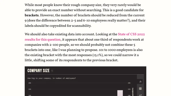
Analysis of using numerical inputs vs. brackets for survey questions like age and income, focusing on UX and data analysis trade-offs.
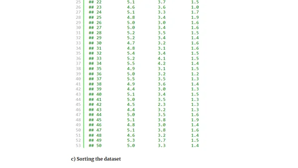
A quick-start guide to using the R programming language for data analysis, covering installation, data exploration, and basic plotting with the iris dataset.
An introduction to the #30DayChartChallenge, a community data visualization event with daily prompts for April, including its origins and format.
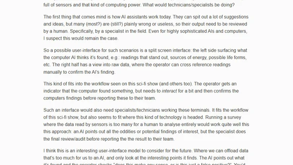
Explores a future AI-assisted computer interface model inspired by sci-fi, where AI highlights data anomalies for human specialist review.
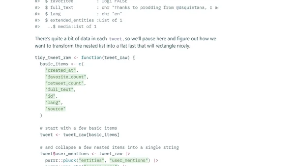
A technical tutorial on using R to read, analyze, and visualize your downloaded Twitter archive data, including tweets, likes, and ad history.
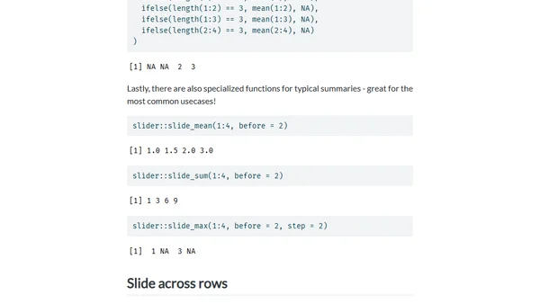
A tutorial demonstrating how to use the R `slider` package for rolling window analysis, using NFL quarterback performance data as an example.
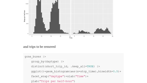
Analysis of Auckland bus cancellations using R and GTFS data to visualize which trips are being removed from the timetable.
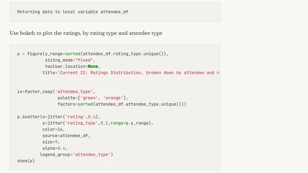
Analyzing conference session ratings using DuckDB and Jupyter Notebooks to demonstrate data wrangling and SQL on raw CSV data.
The State of CSS 2022 survey is now open, gathering developer feedback on new CSS features, pain points, and usage patterns.
A warning about a subtle pandas groupby issue that can lead to incorrect data aggregation sums if missing values are not handled properly.
An analysis of futurist prediction methods, comparing accurate forecasters with those who have poor track records.