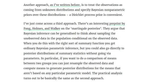
A Bayesian t-test, again
Explores Bayesian alternatives to the frequentist t-test for comparing two means, discussing non-parametric and resampling-based approaches.

Explores Bayesian alternatives to the frequentist t-test for comparing two means, discussing non-parametric and resampling-based approaches.
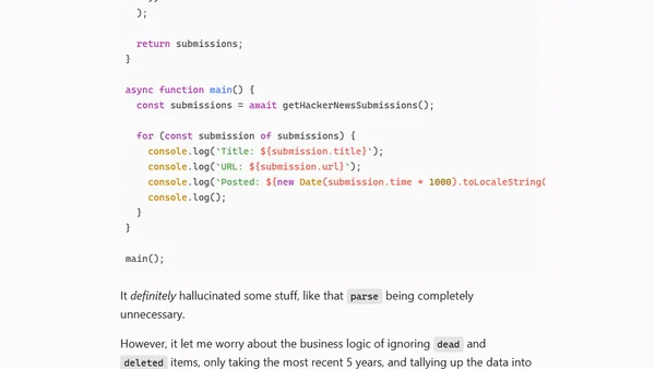
Analysis of 5 years of Hacker News 'Who's Hiring' thread data using Deno and the HN API to visualize tech hiring trends.
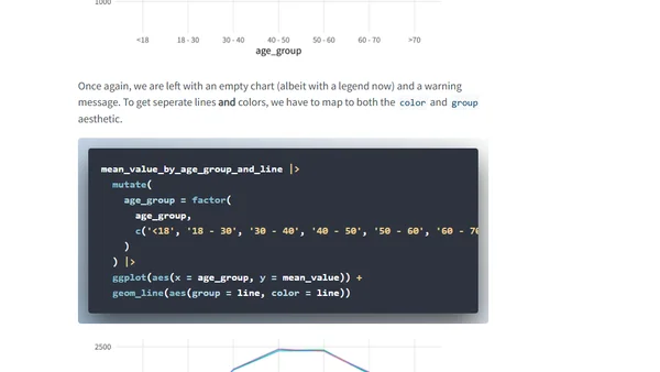
A technical guide explaining why ggplot2 line charts sometimes appear blank and how to fix the issue, focusing on data structure and grouping.
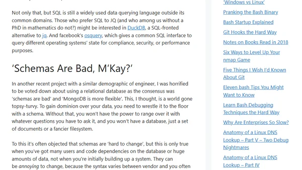
A developer reflects on SQL's relevance after a colleague's unfamiliarity with it, questioning if it's becoming a niche skill in modern tech stacks.
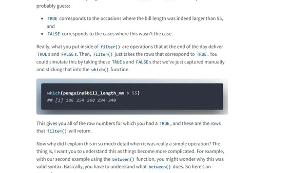
A tutorial on the six most fundamental R functions for data cleaning, using the tidyverse and palmerpenguins dataset.
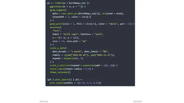
Using R simulations to calculate birthday probabilities instead of complex probability math, with code examples.
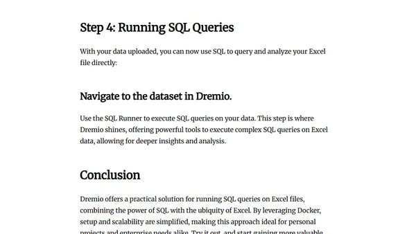
A tutorial on using Dremio and Docker to run SQL queries directly on Excel files from your local machine.

A technical walkthrough of preparing and analyzing the global Open Charge Map dataset for EV charging points using DuckDB and Python.
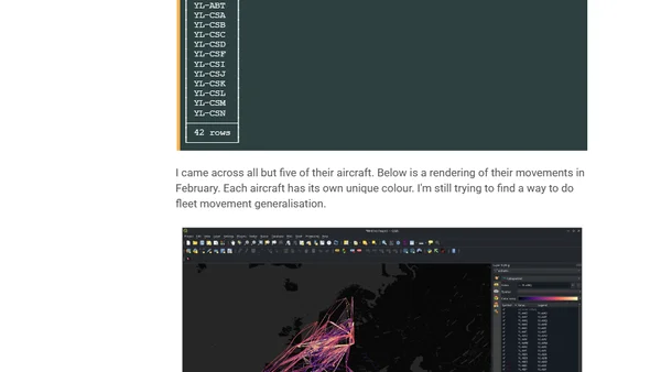
A technical analysis of aircraft flight routes using ADS-B telemetry data, Python, and GIS tools, focusing on a specific AirBaltic Airbus A220-300.
Argues against using LLMs to generate SQL queries for novel business questions, highlighting the importance of human analysts for precision.
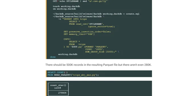
A benchmark analysis of DuckDB's performance on a massive 1.1 billion row NYC taxi dataset, comparing it to other database technologies.
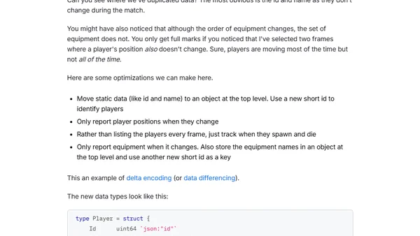
Explains techniques for compressing and analyzing CS2 game demo files using Protocol Buffers and custom data structures for performance analysis.
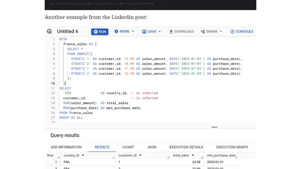
Introduces BigQuery's new GROUP BY ALL syntax, which automatically infers grouping keys from SELECT items to simplify complex SQL queries.
A guide to analyzing git commit history and file changes using Azure Data Explorer for better repository visibility.
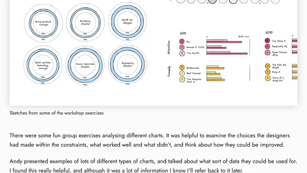
A review of an online data visualization fundamentals workshop led by expert Andy Kirk, covering analysis, chart selection, and practical exercises.
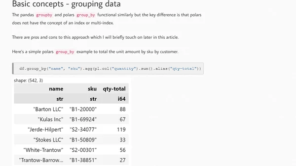
A comparison of Polars and Pandas for data analysis in Python, focusing on Polars' API, performance benefits, and use cases.
Interview with Emanuel Zgraggen, CEO of Einblick, on his career journey and building a visual computing platform for accessible data analysis.
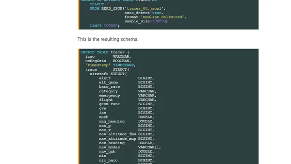
A technical guide on analyzing global flight tracking data from ADS-B receivers using Python, DuckDB, and QGIS.
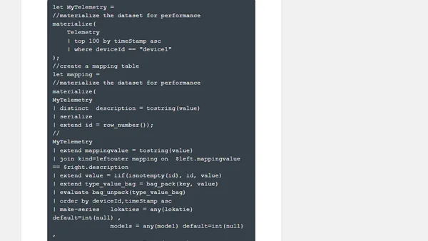
Explores methods for handling Change Data Capture (CDC) patterns from IoT devices within Azure Data Explorer for data analysis.
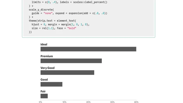
A tutorial on customizing bar chart labels in ggplot2, focusing on placing category labels above bars and styling visualizations.