You Need to Start Branding Your Graphs. Here's How, with ggplot!
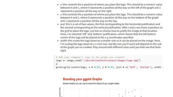
Read OriginalThis article argues for the importance of branding data visualizations created with ggplot, using examples from FiveThirtyEight and The Economist. It explains how branded graphs increase visibility, create cross-departmental opportunities, and enhance professional reputation. The tutorial then provides practical steps to implement custom color palettes and themes.

Comments
No comments yet
Be the first to share your thoughts!
Browser Extension
Get instant access to AllDevBlogs from your browser
Top of the Week
No top articles yet