6/6/2017
•
EN
How the minmax() Function Works
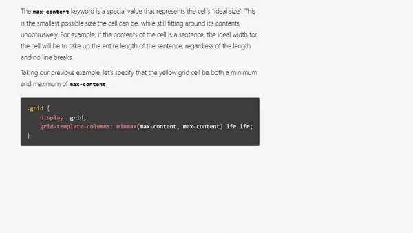
Explains the CSS minmax() function for creating flexible grid layouts with minimum and maximum size constraints.