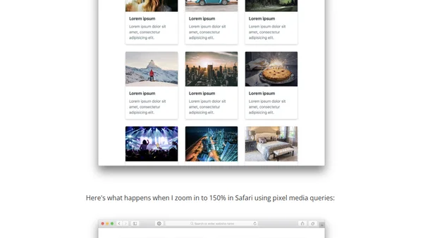
Don't Use Em for Media Queries
Read OriginalThis technical article analyzes a now-fixed bug in Safari where using 'em' units for CSS media queries caused breakpoints to trigger incorrectly when zooming, unlike 'px' units which behaved consistently. It details the practical consequences for responsive layouts and originally concluded that pixels were the safer choice for cross-browser compatibility.
Comments
No comments yet
Be the first to share your thoughts!
Browser Extension
Get instant access to AllDevBlogs from your browser
Top of the Week
No top articles yet