![[Web dev for beginners] CSS layout: flexbox, grid, media queries and container queries](https://alldevblogs.blob.core.windows.net/thumbs/article-466bf810c713-full-36a43165.webp)
[Web dev for beginners] CSS layout: flexbox, grid, media queries and container queries
A beginner's guide to CSS layout techniques including Flexbox, Grid, and responsive queries for web development.
![[Web dev for beginners] CSS layout: flexbox, grid, media queries and container queries](https://alldevblogs.blob.core.windows.net/thumbs/article-466bf810c713-full-36a43165.webp)
A beginner's guide to CSS layout techniques including Flexbox, Grid, and responsive queries for web development.
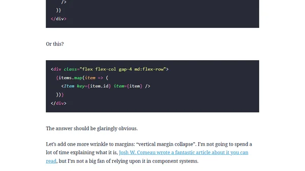
Argues for using CSS Flex/Grid gaps over margins for spacing elements, promoting a parent-controlled layout strategy for cleaner, more maintainable code.
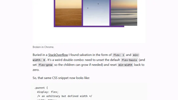
A developer shares a specific CSS Flexbox inconsistency between Firefox and Chrome, and the solution using flex: 1 and min-width: 0.
A CSS expert argues for implementing masonry layout as a separate 'display: masonry' property, citing better defaults and easier teaching compared to using CSS Grid.

A CSS expert argues for implementing masonry layout as a separate 'display: masonry' property with good defaults, rather than as part of CSS Grid.
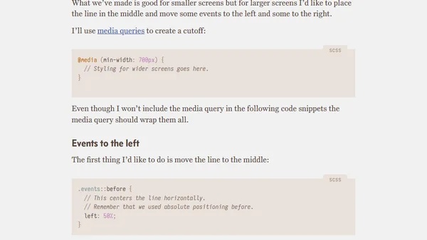
A tutorial on creating a clean, responsive timeline using CSS flexbox, with step-by-step code examples for markup and styling.

A technical analysis comparing CSS Grid and Flexbox performance, finding no significant speed difference in modern browsers.
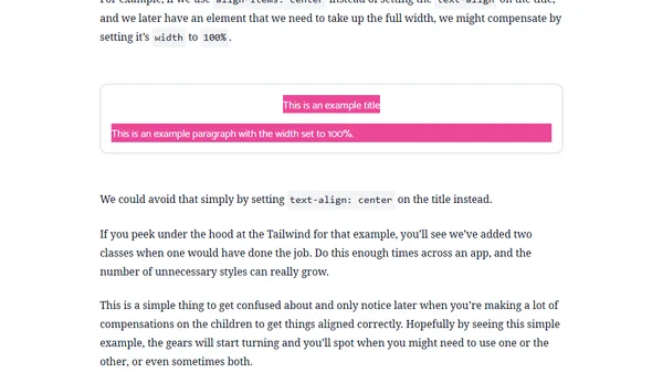
Explains the key difference between `align-items: center` and `text-align: center` in Flexbox columns, especially for cross-platform React development.
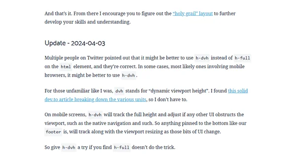
A quick guide to creating a 'minimum full height' layout using Tailwind CSS, explaining the key classes and markup structure.
A comprehensive CSS tutorial covering multiple methods to center a div, including Flexbox, Grid, and auto margins.
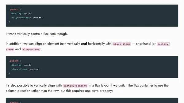
Explains new and existing CSS techniques for vertically centering elements, including upcoming browser support for simpler methods.
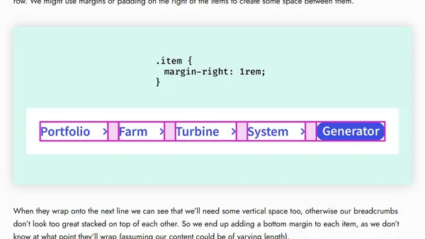
Explores the use of the CSS `gap` property in Flexbox layouts, highlighting its benefits over margins for spacing in responsive designs like breadcrumbs.
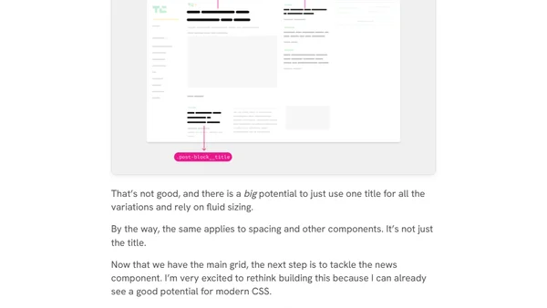
A technical case study exploring how to rebuild the TechCrunch website layout using modern CSS techniques like Flexbox and Grid.
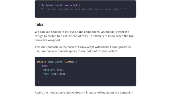
Explores the need for CSS flex-wrap detection, detailing use cases like responsive headers and tabs for better layout control.
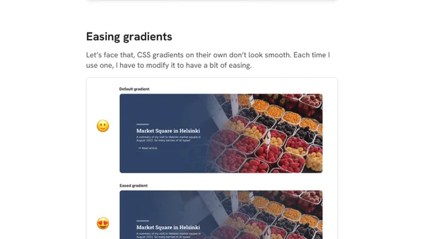
A developer shares a personal wishlist of desired CSS features, including flex wrapping detection, logical gradients, and easing for smoother visual effects.
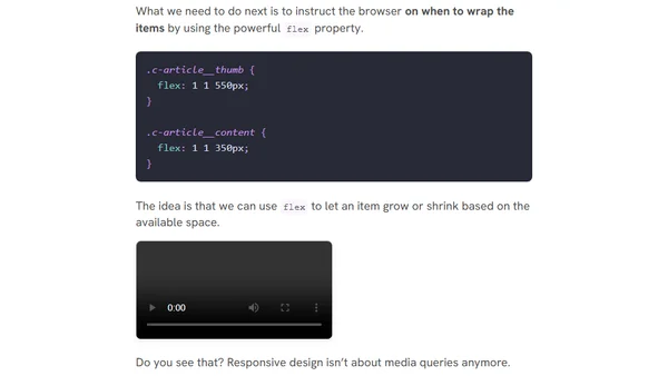
A guide exploring modern responsive web design techniques, including fluid layouts, container queries, and user preference media queries for 2023 and beyond.
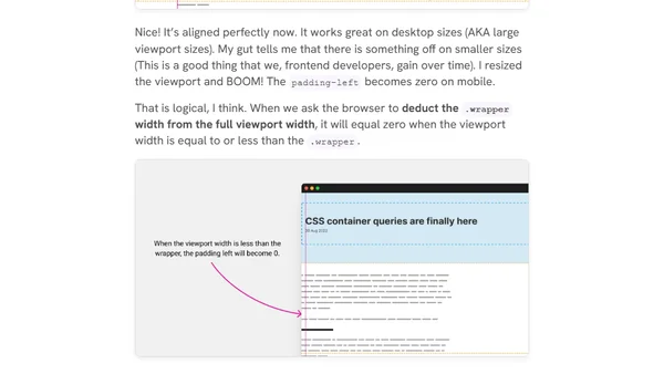
A frontend developer explains the thought process and CSS techniques (grid, flexbox, logical properties) used to build a responsive article layout.
An interactive guide explaining the core concepts of CSS Flexbox, including properties like flex-grow, flex-shrink, and alignment.
A talk on modern CSS layout techniques, emphasizing flexibility and new features like Container Queries and :has().