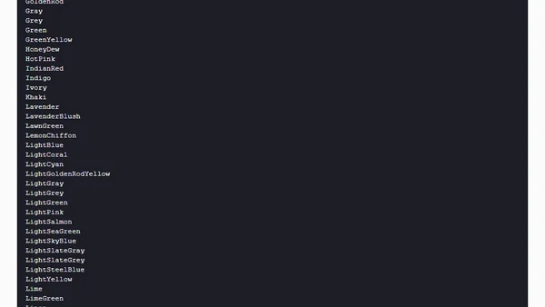
column-count in CSS, For Responsive Layouts
Explains how to use the CSS column-count property to create responsive multi-column layouts, with practical examples.
Andy shares a nostalgic iTunes-style visualizer tool for single-screen use and introduces his web development work and CSS course.
A 90-second video and transcript explaining CSS Custom Properties (CSS variables), including syntax, scoping, defaults, and dynamic usage.
A developer's guide to implementing a user-toggleable dark mode on a website using CSS custom properties and JavaScript.
A comprehensive guide to spacing in CSS, covering margins, padding, grid/flexbox gaps, and practical use cases for layout design.
Explores two methods for making CSS Motion Path animations responsive, addressing the challenge of scaling fixed-size paths for different viewports.
A developer explains using CSS vmin units for a fluid, responsive website layout that scales proportionally with the viewport.
A developer shares their 100-day journey of tweeting about a different CSS property each day, highlighting the vastness of CSS.
A developer details the CSS flexbox and responsive design updates made to their personal photo journal website.
Analyzes a poll on third-party code usage in front-end development, comparing JavaScript vs. CSS reliance and discussing performance trade-offs.
Andy discusses using CSS for print styling, specifically for Piccalilli invoices, and shares a resource from Rachel Andrew.
Explains LCH colors in CSS, their advantages over RGB/HSL, and browser implementation status for accessing wider color gamuts.
A developer shares how they built an interactive web-based timetable using HTML tables, CSS, and JavaScript to manage family activities during lockdown.
An introduction to CSS Logical Properties, explaining how they create flexible spacing that adapts to content direction and user language.
A guide to CSS viewport units (vw, vh, vmin, vmax) explaining their calculations, differences from percentages, and practical use cases like responsive typography.
Andy Bell launches the new Piccalilli website, featuring front-end development tutorials, courses, and a newsletter.
A technical guide explaining the syntax, keyframes, and properties for creating animations using pure CSS.
A tutorial on using CSS Flexbox and Grid box alignment properties like align-content and justify-content to control layout.
Andy Bell shares his RSS feed of liked articles and introduces his web development work, including Set Studio and Piccalilli.
Andy announces a pause in streaming to focus on launching Piccalilli, a front-end development publication, and mentions his CSS course.