Responsive Images Crash Course for ASP.NET Core Developers
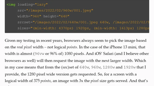
A guide for ASP.NET Core developers on optimizing image delivery using HTML's srcset and sizes attributes to improve performance and Core Web Vitals.
A developer explains why they chose not to implement AVIF image format on their site, opting instead to optimize JPEG quality for file size savings.
A developer analyzes the practical challenges of responsive images on modern high-resolution smartphones, questioning if serving smaller image variants is still effective.
A nostalgic and analytical look back at the dark themes and lasting impact of the Animorphs book series.
A technical guide on implementing a blur-to-load image experience to prevent layout shift and improve loading performance.
A tutorial on implementing art direction with Gatsby-Image to load different images based on screen size for performance.
Explains how to implement responsive images in Jekyll using a pre-render hook and a custom regex to replace Markdown syntax with a Liquid tag.
Explores how to use the Save-Data header to optimize web performance without degrading user experience, with practical examples.
Revisits the 'compressive images' technique for responsive web design, analyzing its modern relevance, performance trade-offs, and memory impact.
A guide to implementing responsive images for web performance, covering mindset, techniques, and calculations for optimal image delivery.
Stitcher beta 2 release introduces new features like async rendering, sitemap support, and breaking config changes ahead of version 1.0.
A technique for using responsive images with CSS background properties, enabling flexible hero images with optimized loading.
Announces Stitcher alpha 4 release with HTTP2 server push support, bug fixes, optimizations, and a new CDN configuration parameter.
A developer discusses implementing an image optimization library within the Stitcher framework's responsive images module.
Explains an algorithm for responsive images that scales based on target file size to optimize bandwidth, with PHP implementation details.
A developer discusses implementing the responsive images spec in Stitcher, focusing on challenges of image downscaling and integration.
A technical guide explaining how to use the srcset and sizes attributes for implementing responsive images in modern web development.
A roundup of browser updates, bug fixes, and developer tools for July 2015, covering asm.js, responsive images, and debugging platforms.
Explains how to use the HTML <picture> element for better SVG fallback and art direction, replacing JavaScript-based methods.
Explores the implementation of responsive images using srcset, sizes, and picture elements, advocating for a combined front-end and server-side approach.