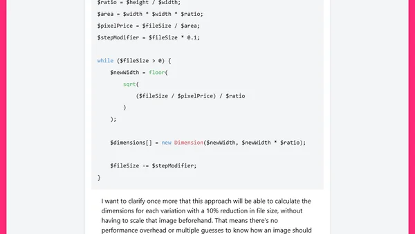
Responsive images done right
Read OriginalThis article explains the principles and practical implementation of responsive images to improve website performance. It discusses generating multiple image variations based on screen size and file size, moving beyond simple width-based approaches to more optimal, automated solutions using srcset and calculations.
Comments
No comments yet
Be the first to share your thoughts!
Browser Extension
Get instant access to AllDevBlogs from your browser
Top of the Week
No top articles yet