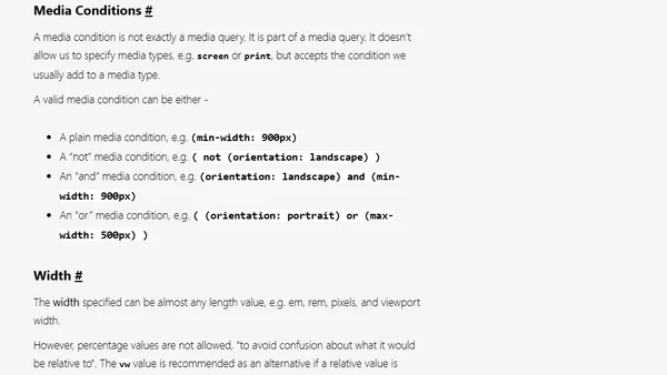
Responsive Images - The srcset and sizes Attributes
Read OriginalThis article provides a detailed technical tutorial on the HTML srcset and sizes attributes, which are essential for serving responsive images. It explains how to define different image sources for various screen sizes and pixel densities, covers the syntax for media conditions and width descriptors, and demonstrates how browsers select the optimal image to improve performance and user experience.
Comments
No comments yet
Be the first to share your thoughts!
Browser Extension
Get instant access to AllDevBlogs from your browser
Top of the Week
No top articles yet