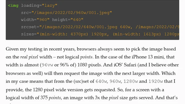
📄 Contemplating the usefulness of responsive images
Read OriginalThe article explores the author's technical investigation into responsive image delivery for photo-sharing websites on modern smartphones. Using their iPhone 13 mini as a case study, they detail how browser behavior, device pixel ratios, and viewport calculations lead to larger-than-expected image files being served, questioning the continued usefulness of smaller image variants in srcset attributes given current device trends.
Comments
No comments yet
Be the first to share your thoughts!
Browser Extension
Get instant access to AllDevBlogs from your browser
Top of the Week
No top articles yet