Tackling responsive images - part 2
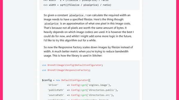
Read OriginalThis technical article details the development of a responsive image library. It moves beyond simple width-based scaling to a file-size-based algorithm, using a derived mathematical formula to calculate image dimensions for optimal bandwidth usage. The post includes the PHP code implementation within the Stitcher framework.
Comments
No comments yet
Be the first to share your thoughts!
Browser Extension
Get instant access to AllDevBlogs from your browser
Top of the Week
No top articles yet