Zero Sum Problems
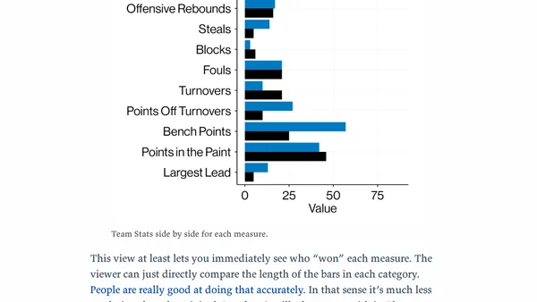
Analysis of Apple Sports app's confusing zero-sum data visualization for basketball stats, with critique from a data visualization expert.
Kieran Healy is a Professor of Sociology at Duke University, specializing in social networks, data visualization, and sociological theory. He is the author of several books, including The Ordinal Society and Data Visualization.
15 articles from this blog
Analysis of Apple Sports app's confusing zero-sum data visualization for basketball stats, with critique from a data visualization expert.
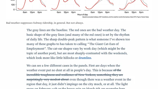
Analyzes NYC subway ridership data to see how bad weather affects travel patterns, revealing when people stay home or brave the elements.
Visualizing NYC subway hourly flows with 424 pie charts, breaking data visualization rules using MTA origin-destination data.
An R package for mapping NYC geographies like Census Tracts and NTAs, with code examples.
Author details using Quarto to write a technical book on data visualization with R and ggplot, focusing on its advantages and workflow.
Announcement of the second edition of a data visualization book, updated for modern R and ggplot, with discussion on LLMs in coding.
A blog covering data visualization, spatial analysis in R, election mapping, and social science data, with a focus on technical methods and tools.
A blog archive listing posts about data visualization, statistical analysis, and data science using the R programming language.
A keynote on trustworthy data visualization, exploring trust in an era of fake results, AI confabulation, and data infrastructure decay.
A blog archive listing numerous data visualization projects, tutorials, and analyses, primarily focused on demographic, social, and public data.
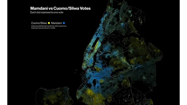
A technical analysis of NYC mayoral election results using R, spatial data, and GIS techniques to create maps visualizing precinct-level voting patterns.
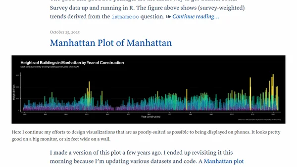
A data visualization blog post explaining the creation of a 'Manhattan plot' chart showing building heights in Manhattan over time, with technical details on design choices.
The author discusses updates to gssrdoc, an R package that provides integrated help documentation for the General Social Survey (GSS) dataset.
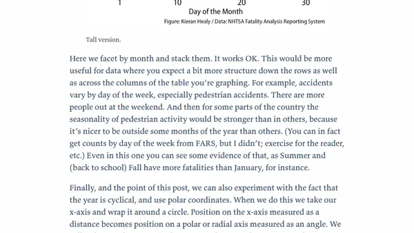
Analyzing pedestrian fatality data using polar coordinate visualizations to reveal cyclical patterns in daily accident counts.