Dual Axis Line Charts in Plotly
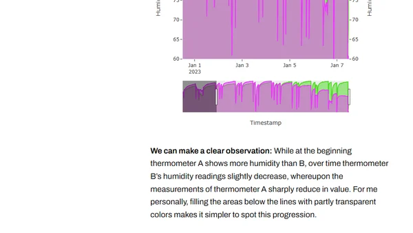
Read OriginalThis article explores the utility of dual-axis line charts for visualizing time series data in Python's Plotly library. It argues for their specific use in comparing correlated series, like temperature and humidity from different sensors, and demonstrates how to create interactive charts with features like range selectors to aid exploratory data analysis.
Comments
No comments yet
Be the first to share your thoughts!
Browser Extension
Get instant access to AllDevBlogs from your browser
Top of the Week
No top articles yet