3/29/2018
•
EN
Super-powered layouts with CSS Variables + CSS Grid
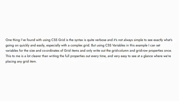
Explores combining CSS Variables with CSS Grid to create dynamic, responsive layouts with cleaner, more maintainable code.