Brand New Layouts with CSS Subgrid
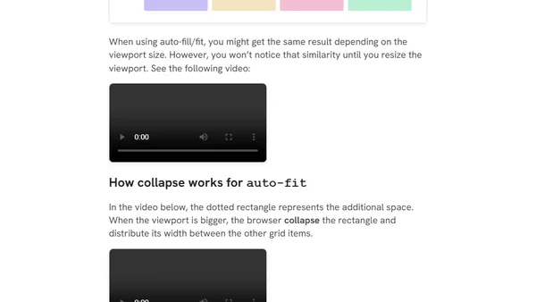
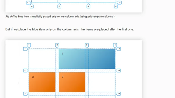
A tutorial exploring CSS Subgrid, showing how it extends grid layouts and enables new UI possibilities beyond basic CSS Grid.
A technical article discussing responsive design challenges and proposing better CSS composition strategies for complex layout changes across breakpoints.
Explains how to dynamically change CSS custom properties (variables) using Tailwind CSS utility classes for responsive layouts.
Explores using CSS :has() selector with animated grid tracks to create interactive layouts, with current browser support limitations.
A tutorial on creating grid layouts using Compositional Layout in iOS, explaining fractional sizing for items and groups.
A comprehensive guide to the CSS Grid minmax() function, explaining its syntax, behavior, and practical use cases for responsive layouts.
Explores CSS Grid auto-placement, explicit item positioning, and the use of grid-template-areas for layout control.
Explains CSS Grid's fr (fraction) units, covering their use for responsive layouts, common pitfalls, and how they interact with fixed tracks.
A CSS Grid tutorial on using pseudo-selectors to control the layout of leftover items (widows) in a grid, comparing it to flexbox solutions.
Explains how to use negative line numbers in CSS Grid to position items relative to the end of a grid, including implicit track creation.
Explains the key differences between CSS Grid's grid-template-* and grid-auto-* properties, focusing on explicit vs. implicit grids.
A guide to remembering and effectively using CSS Grid properties by grouping them into logical categories like explicit grid, gaps, alignment, and implicit grid.
A technical guide to creating CSS Grid layouts with aspect-ratio cells using CSS variables and the padding hack.
Explains the CSS minmax() function for creating flexible grid layouts with minimum and maximum size constraints.
An explanation of CSS Grid Layout's core terminology, including grid containers, items, lines, columns, rows, and tracks.
Explores three new CSS features for 2017: Feature Queries, Grid Layout, and Flexible Lengths, with practical code examples.
A technical guide on using CSS Flexbox to create responsive, self-adjusting grid layouts that handle dynamic content elegantly.
A technical guide on integrating the Masonry JavaScript library with the Susy CSS grid framework to create Pinterest-style layouts.
Explains how gutter positions work in the Susy CSS grid framework and how they affect layout margins and paddings.
Explores solving dynamic grid layout problems using pure CSS logic, like handling orphaned items, without relying on preprocessors or JavaScript.