Fighting decision paralysis
A web developer shares personal strategies for overcoming decision paralysis in design, coding, and content creation.
Zell Liew is a front-end developer, writer, and creator known for deep, practical explorations of CSS, JavaScript, accessibility, and modern web tooling. His work blends thoughtful technical guidance with personal reflections on life, work, and growth, and is frequently featured on CSS-Tricks and Splendid Labz.
341 articles from this blog

A web developer shares personal strategies for overcoming decision paralysis in design, coding, and content creation.
A developer shares a four-phase technique for speed reading and retention, explaining why reading skills are crucial for tech professionals.
A tutorial on building a custom responsive grid system for web design, covering design considerations, breakpoints, and CSS vs. HTML grid approaches.
A deep dive into designing web layout grids, covering column sizing, responsiveness, and choosing between equal or unequal widths.
A critique of the common developer advice 'Don't reinvent the wheel,' exploring its psychological impact and arguing for the value of building from scratch.
A developer reflects on the pressure to learn coding quickly, arguing that focusing on deep understanding is more important than speed.
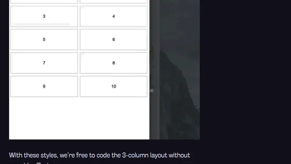
Explains why resetting Susy's span/gallery mixins is wrong and provides better solutions for responsive grid layouts.

A guide on how to ask clear, specific, and well-researched coding questions to get faster and better answers from experts.
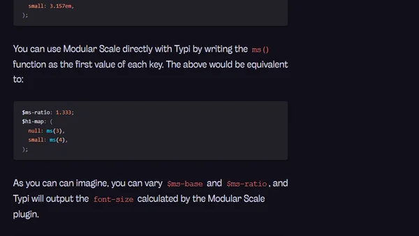
A guide to using the Modular Scale Sass library for responsive typography, including integration with the Typi library.
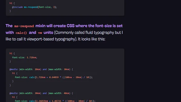
A technical guide on implementing responsive typography by dynamically changing the Modular Scale ratio at different CSS breakpoints.
Explains why font-sizes from a Modular Scale can be too large on mobile and offers practical solutions, like using a smaller ratio.
A web designer explores whether strict adherence to vertical rhythm in typography is always correct, arguing for the principle of proximity to improve readability.
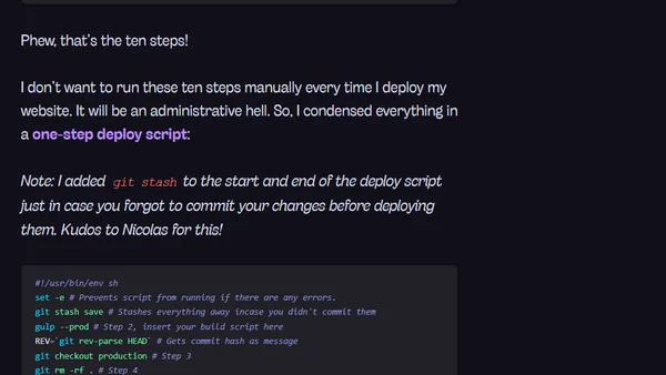
A technical guide on automating static site deployment using cron jobs and Git to schedule and publish blog posts.
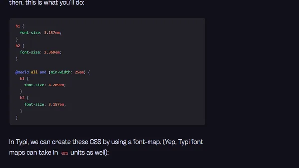
Advanced tutorial on using the Typi library for responsive typography, covering em media queries and integration with other libraries.
A tutorial on using Typi, a Sass library for creating responsive typography with easy setup and mobile-first CSS.
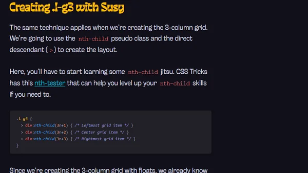
A guide to transitioning from HTML grid systems like Bootstrap to CSS grid systems like Susy or Neat, outlining a four-step process.
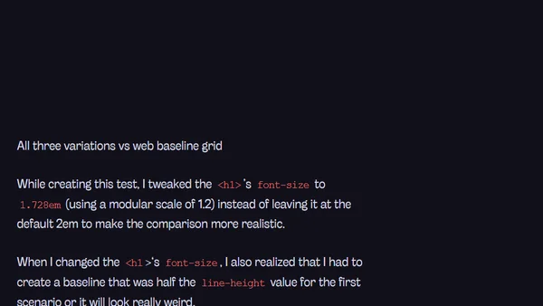
An analysis of whether web typography is broken due to baseline grid issues, exploring CSS techniques and design principles.
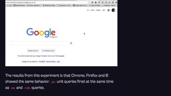
A technical analysis comparing the use of px, em, and rem units in CSS media queries, testing their behavior under different conditions.
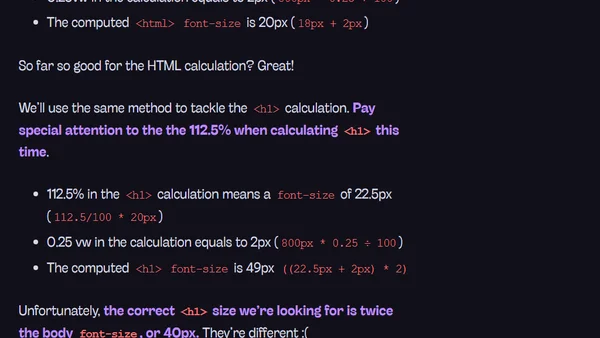
Explores using CSS viewport units (vw, vh, vmin, vmax) for responsive typography to reduce reliance on media queries.
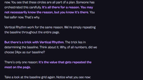
Explains the importance of Vertical Rhythm in web typography, covering its principles, implementation, and connection to design repetition.