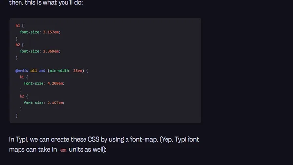
Advanced Usage with Typi
Advanced tutorial on using the Typi library for responsive typography, covering em media queries and integration with other libraries.

Advanced tutorial on using the Typi library for responsive typography, covering em media queries and integration with other libraries.
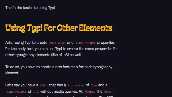
A tutorial on using Typi, a Sass library for creating responsive typography with easy setup and mobile-first CSS.
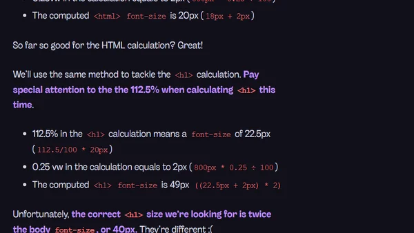
Explores using CSS viewport units (vw, vh, vmin, vmax) for responsive typography to reduce reliance on media queries.
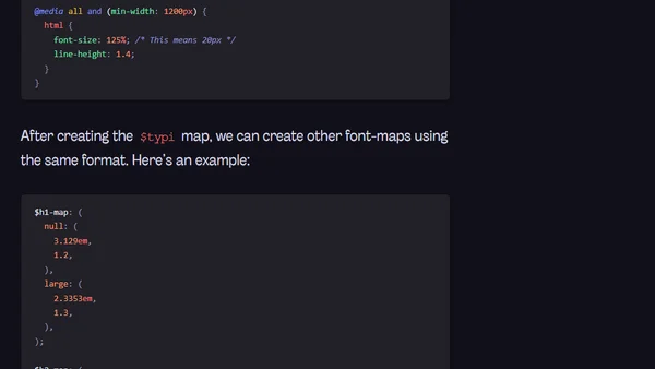
A developer shares best practices for responsive web typography and introduces Typi, a solution to simplify implementation.