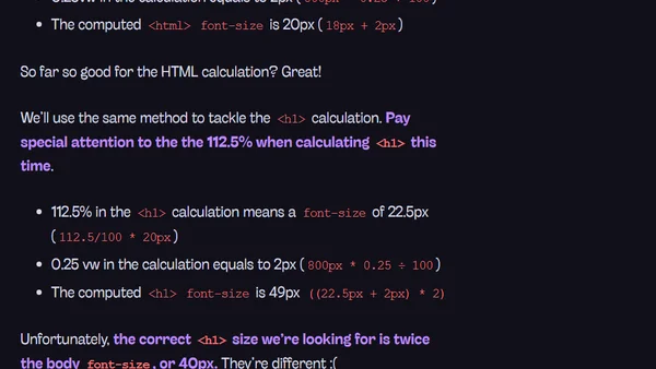
Viewport Unit Based Typography
Read OriginalThis technical article discusses the application of CSS viewport units (vw, vh, vmin, vmax) for creating responsive typography. It compares the traditional method of using media queries to adjust font sizes with the dynamic, automatically recalculating nature of viewport-based units, providing code examples to illustrate the advantages and implementation.
Comments
No comments yet
Be the first to share your thoughts!
Browser Extension
Get instant access to AllDevBlogs from your browser
Top of the Week
No top articles yet