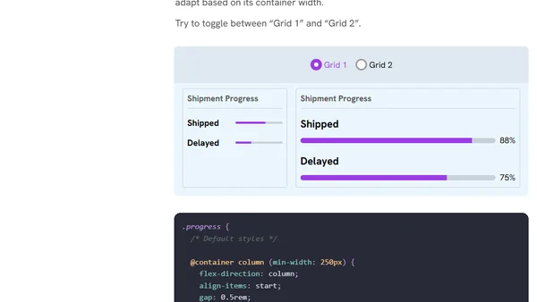
CSS Findings From The Threads App
A technical analysis of the CSS implementation in Meta's Threads app, focusing on its use of CSS Grid for post layouts.
Explains new CSS viewport units (svh, lvh, dvh) that solve mobile layout issues caused by dynamic browser UI elements like address bars.
A designer announces a new conference talk about iterative UX design for diverse devices and invites speaking opportunities at tech events.
Andy introduces a viewport logger tool to collect data on screen fragmentation and encourages testing on various devices.
A tutorial on creating fluid, responsive typography using the CSS clamp() function to make font sizes scale dynamically with screen or container size.
Explores the need for CSS flex-wrap detection, detailing use cases like responsive headers and tabs for better layout control.
A guide exploring modern responsive web design techniques, including fluid layouts, container queries, and user preference media queries for 2023 and beyond.
Andy Bell updates his 'Build Excellent Websites' site with a talk video and source code, focusing on letting the browser control design.
Explains why using unitless ratios for CSS line-height is better than fixed pixel values for responsive, flexible typography.
An interactive guide explaining the core concepts of CSS Flexbox, including properties like flex-grow, flex-shrink, and alignment.
Author updates on new web design book edition, potential Vim/JavaScript projects, and shares experiences with custom keyboards and input devices.
Explains why using px units for CSS font-size can harm accessibility and override user preferences, advocating for em/rem units instead.
Explores practical use cases for CSS comparison functions like clamp(), max(), and min(), including fluid sizing, decorative elements, and hero sections.
A talk on modern CSS layout techniques, emphasizing flexibility and new features like Container Queries and :has().
CSS container queries are now supported in modern browsers, enabling responsive component design based on parent container size instead of viewport.
Explains how CSS logical properties like padding-inline provide shorthands for setting spacing on a single axis, improving code maintainability.
A developer discusses the importance of testing websites on ultrawide (21:9) screens, not just standard 16:9, and provides a simple method for emulating these resolutions.
A CSS tutorial on techniques for creating full-width components within a centrally constrained layout, discussing markup and styling solutions.
Ahmad Shadeed's Defensive CSS is a detailed resource of techniques for building resilient, robust front-end user interfaces.
A guide to using the CSS aspect-ratio property for responsive design, with syntax and visual examples.