How to make fluid typography with CSS
A tutorial on creating fluid, responsive typography using the CSS clamp() function to make font sizes scale dynamically with screen or container size.

A tutorial on creating fluid, responsive typography using the CSS clamp() function to make font sizes scale dynamically with screen or container size.
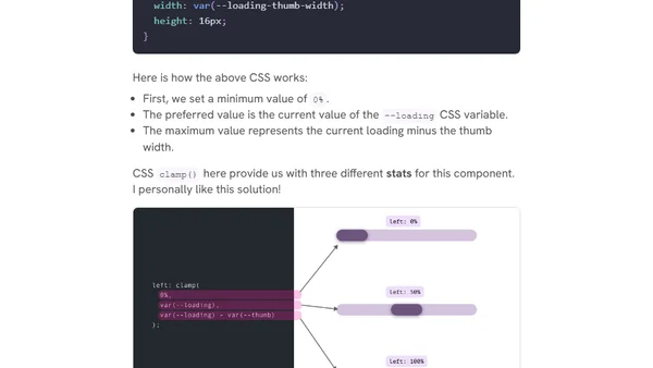
Explores practical use cases for CSS comparison functions like clamp(), max(), and min(), including fluid sizing, decorative elements, and hero sections.
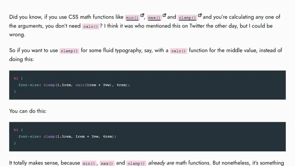
A CSS tip explaining that the calc() function is often unnecessary when using min(), max(), and clamp() for calculations.
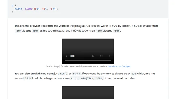
A guide to using the CSS functions min(), max(), and clamp() for responsive element sizing, spacing, and fluid typography.
Andy introduces Utopia, a fluid typography tool, and discusses its algorithmic approach to responsive web design.