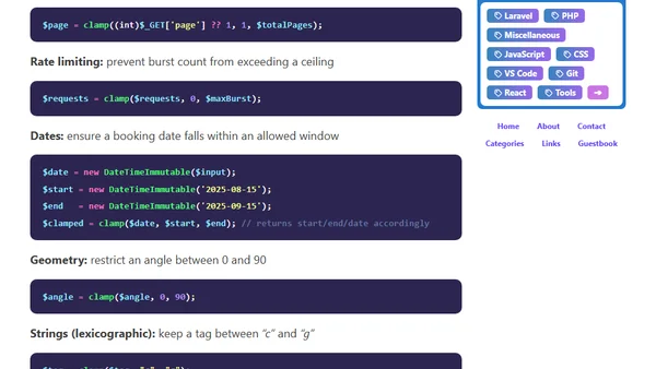
The new clamp() function in PHP 8.6
Introducing the new clamp() function in PHP 8.6 for restricting values to a specified minimum and maximum range.

Introducing the new clamp() function in PHP 8.6 for restricting values to a specified minimum and maximum range.
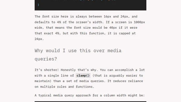
Explains the CSS clamp() function for responsive design, covering its syntax, use cases, and advantages over media queries.
A speaker shares insights from his CSS Day talk on 'Smart Layouts', advocating for fluid, self-adapting CSS using modern features like clamp and container queries.
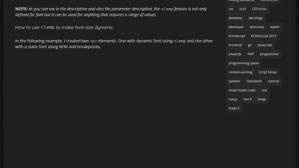
A tutorial on creating fluid, responsive typography using the CSS clamp() function to make font sizes scale dynamically with screen or container size.
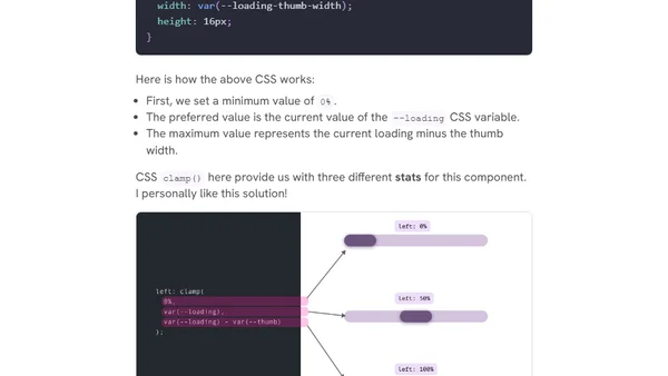
Explores practical use cases for CSS comparison functions like clamp(), max(), and min(), including fluid sizing, decorative elements, and hero sections.
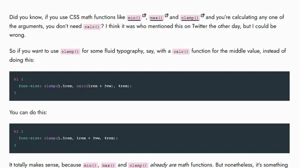
A CSS tip explaining that the calc() function is often unnecessary when using min(), max(), and clamp() for calculations.