How Bad Is Your Colormap?
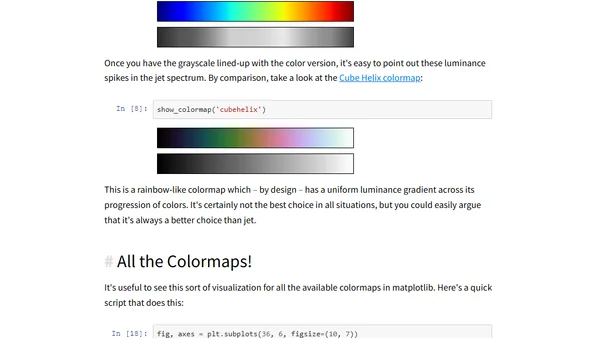
Read OriginalThis technical article argues against using the 'jet' colormap in data visualization, explaining its perceptual flaws. It provides a Python code snippet to convert any matplotlib colormap to a luminance-corrected grayscale version, demonstrating how 'jet' creates misleading luminance spikes. The post references scientific papers and best practices for better figures, targeting developers and scientists who create plots.
Comments
No comments yet
Be the first to share your thoughts!
Browser Extension
Get instant access to AllDevBlogs from your browser
Top of the Week
No top articles yet