Quick and easy ways to deal with long labels in ggplot2
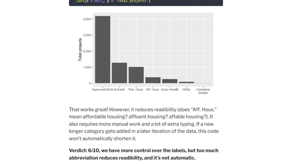
Read OriginalThis technical article provides solutions for handling long, overlapping axis labels in R's ggplot2. It demonstrates practical methods like adjusting plot dimensions, swapping axes, and rotating text, using a real-world dataset of NYC construction projects during COVID-19 as an example. It's a guide for improving data visualization readability.

Comments
No comments yet
Be the first to share your thoughts!
Browser Extension
Get instant access to AllDevBlogs from your browser
Top of the Week
No top articles yet