Lottomatica e le cattive abitudini italiane per l’UX
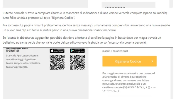
Read OriginalL'articolo critica aspramente la pessima user experience (UX) del sito di Lottomatica, analizzando nel dettaglio la procedura confusa per la generazione di nuovi codici di accesso all'home banking. Usa questo caso come esempio per discutere problemi ricorrenti nella progettazione digitale italiana, come la mancanza di una progettazione UX adeguata, pulsanti posizionati in modo illogico, assenza di indicazioni chiare e messaggi di errore incomprensibili.
0 comments
Comments
No comments yet
Be the first to share your thoughts!
Browser Extension
Get instant access to AllDevBlogs from your browser
Top of the Week
1
Fix your upgrades and migrations with Codemods
Cassidy Williams
•
2 votes
2
Designing Design Systems
TkDodo Dominik Dorfmeister
•
2 votes
3
Introducing RSC Explorer
Dan Abramov
•
1 votes
4
The Pulse: Cloudflare’s latest outage proves dangers of global configuration changes (again)
The Pragmatic Engineer Gergely Orosz
•
1 votes
5
Fragments Dec 11
Martin Fowler
•
1 votes
6
Adding Type Hints to my Blog
Daniel Feldroy
•
1 votes
7
Refactoring English: Month 12
Michael Lynch
•
1 votes
8
Converting HTTP Header Values To UTF-8 In ColdFusion
Ben Nadel
•
1 votes
9
Pausing a CSS animation with getAnimations()
Cassidy Williams
•
1 votes
10
From Random Forests to RLVR: A Short History of ML/AI Hello Worlds
Sebastian Raschka
•
1 votes