Spacing in CSS
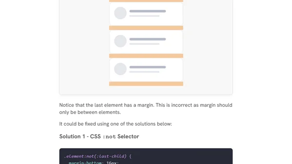
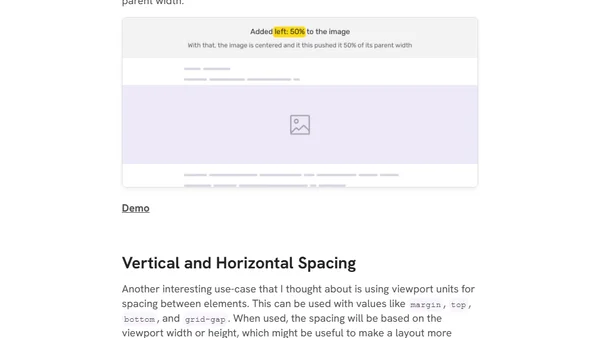
A comprehensive guide to spacing in CSS, covering margins, padding, grid/flexbox gaps, and practical use cases for layout design.
Ahmad Shadeed is a design engineer, author, and Google Developer Expert in Web UI. He writes and speaks about CSS, UI design, and front-end engineering, blending design and code to build better web experiences.
75 articles from this blog
A comprehensive guide to spacing in CSS, covering margins, padding, grid/flexbox gaps, and practical use cases for layout design.
A guide to CSS viewport units (vw, vh, vmin, vmax) explaining their calculations, differences from percentages, and practical use cases like responsive typography.
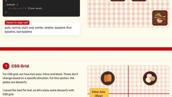
A tutorial on using CSS Flexbox and Grid box alignment properties like align-content and justify-content to control layout.
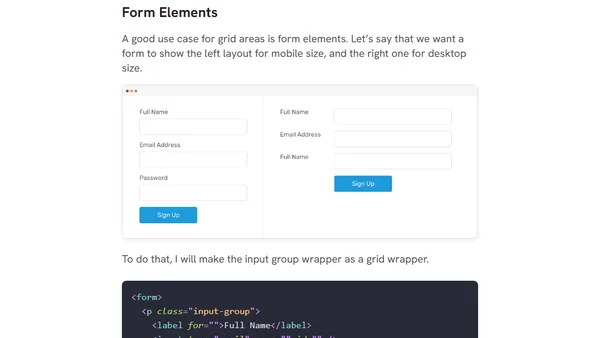
A tutorial on using CSS Grid Template Areas for creating flexible, visually-defined layouts, with examples and comparisons to traditional grid methods.
A guide to the various methods for hiding elements in web development, covering HTML, CSS, accessibility, and animation considerations.
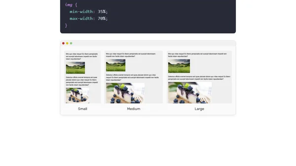
A detailed guide to using min-width, max-width, min-height, and max-height CSS properties with practical examples and use cases.
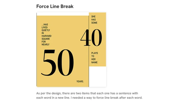
A technical walkthrough of building a creative magazine layout using modern CSS techniques like Grid, Flexbox, and percentage-based margins.
Explores practical uses of CSS Variables (Custom Properties) within inline styles for dynamic grid layouts and component styling.
Explores creative and lesser-known applications of CSS pseudo-elements, such as hover effects and expanding clickable areas, with practical code examples.
A technical guide on implementing a dark mode theme for a website using CSS custom properties and the prefers-color-scheme media query.
A tutorial on recreating the Apple Music playback header using HTML and CSS, focusing on layout with Flexbox and CSS Grid.
Explores advanced and non-obvious use cases for the CSS text-align property in web design and layout.
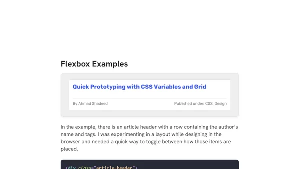
A practical guide demonstrating five real-world layout problems solved using CSS Flexbox, including headers, sidebars, and grids.
A front-end developer's detailed thought process for building a responsive header component from a UI design, using HTML and CSS.
A developer explains why they switched from icon fonts to SVG for web icons, citing performance, accessibility, and maintainability benefits.