Share Your Site with the Masses
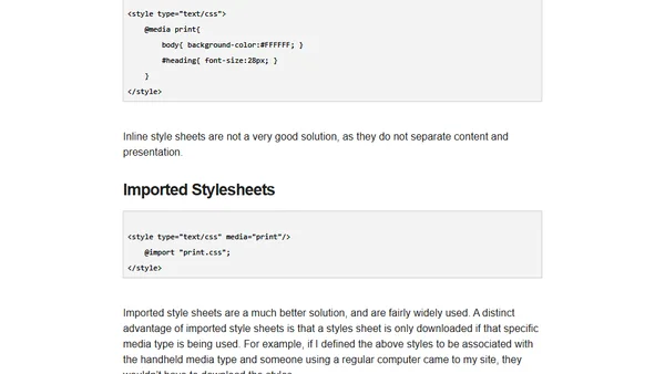
Read OriginalThis technical article details the use of CSS media types to adapt website content for various output devices. It covers the 10 media types defined in CSS 2, such as 'print', 'screen', and 'handheld', and explains three methods for implementing them: inline styles, imported stylesheets, and linked stylesheets, discussing the pros and cons of each approach.
Comments
No comments yet
Be the first to share your thoughts!
Browser Extension
Get instant access to AllDevBlogs from your browser
Top of the Week
No top articles yet