#013 Wykres Sankeya (Sankey diagram)
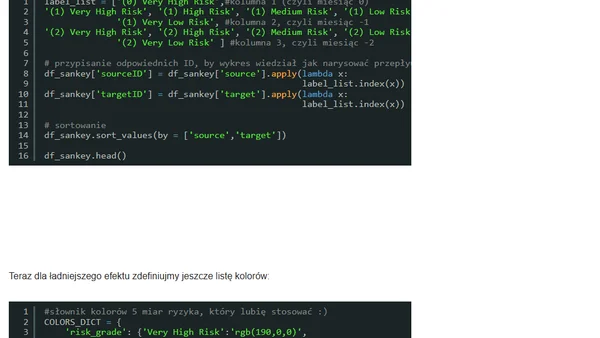
Read OriginalArtykuł szczegółowo omawia wykresy Sankeya (diagramy strumieniowe), przedstawiając ich historię, zasadę działania oraz zastosowanie w wizualizacji przepływów. Zawiera praktyczny przykład implementacji w języku Python z wykorzystaniem biblioteki Plotly, w tym instrukcje przygotowania danych i kod do stworzenia diagramu prezentującego przepływ klientów między grupami ryzyka.
Comments
No comments yet
Be the first to share your thoughts!
Browser Extension
Get instant access to AllDevBlogs from your browser
Top of the Week
1
Introducing GPT-5.1 for developers
Simon Willison
•
4 votes
2
Using A Hidden Submit Button To Ensure Unnamed Submissions
Ben Nadel
•
3 votes
3
uv+just for testing multiple Python versions
Daniel Feldroy
•
3 votes
4
ServiceNow and Microsoft Copilot
Marius Sandbu
•
2 votes
5
🧠 Build an Agent Chat that Remembers — Persisting Conversations with Microsoft Agent Framework
Bruno Capuano
•
2 votes
6
Agentic AI and Security
Martin Fowler
•
2 votes
7
Springs and Bounces in Native CSS
Josh Comeau
•
2 votes
8
Importing vs fetching JSON
Jake Archibald
•
2 votes
9
Hire Me in Japan
Dan Abramov
•
1 votes
10
In the economy of user effort, be a bargain, not a scam
Lea Verou
•
1 votes