World population growth through time
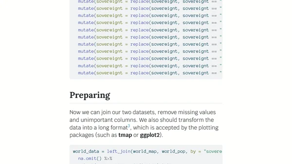
Read OriginalThis article details a data visualization project using R to create scaled, animated cartograms showing world population changes from 1800 to 2100. It explains the process of downloading spatial and population data, data cleaning with packages like dplyr and sf, and generating animations with gganimate to illustrate both distribution and global growth trends.

Comments
No comments yet
Be the first to share your thoughts!
Browser Extension
Get instant access to AllDevBlogs from your browser
Top of the Week
No top articles yet