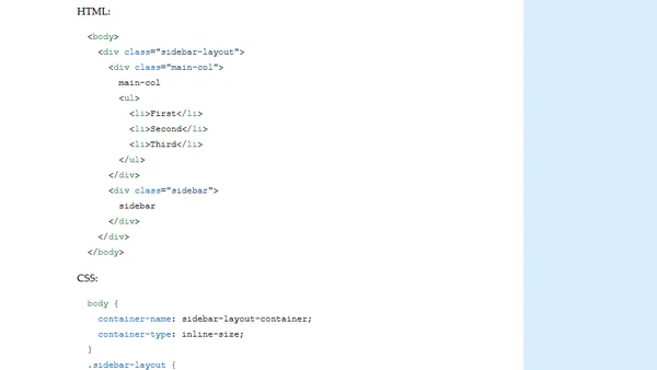
CSS wish: inner breakpoints
Read OriginalThis article explores a conceptual CSS feature called 'inner breakpoints', which would allow responsive layouts based on the sizes of individual HTML elements, not just viewports or containers. It compares this idea to existing media queries and container queries, and provides a practical example of a responsive sidebar layout using grid and container queries to illustrate the potential use case.
Comments
No comments yet
Be the first to share your thoughts!
Browser Extension
Get instant access to AllDevBlogs from your browser
Top of the Week
No top articles yet