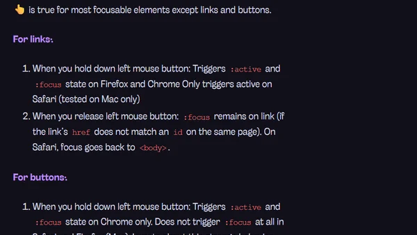
Style hover, focus, and active states differently
Read OriginalThis article argues against the common practice of styling :hover, :focus, and :active states identically in CSS. It details the distinct purposes of each state, emphasizing keyboard accessibility and user feedback. The author provides practical examples and guidelines for styling each state effectively, with a focus on creating clear focus indicators for users navigating with a keyboard.
0 comments
Comments
No comments yet
Be the first to share your thoughts!
Browser Extension
Get instant access to AllDevBlogs from your browser
Top of the Week
No top articles yet