

Building Responsive Layouts Without Writing More CSS
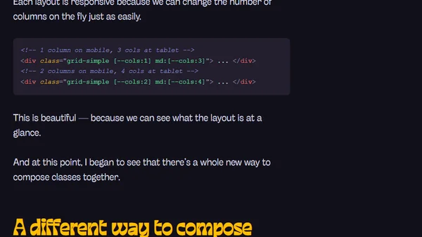
Read OriginalThis article explores how to build responsive layouts without writing additional CSS by using Tailwind CSS. It demonstrates using CSS grid with variables for column counts, then solves the responsiveness problem with Tailwind's breakpoint variants and arbitrary value support. The author shows how to adjust CSS variables directly in HTML at different breakpoints, enabling flexible, reusable components without custom stylesheets.
Comments
No comments yet
Be the first to share your thoughts!
Browser Extension
Get instant access to AllDevBlogs from your browser
Top of the Week
No top articles yet