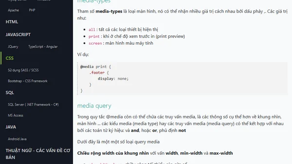
Quy tắc @media trong CSS với thiết kế responsive
Read OriginalBài viết giải thích chi tiết về quy tắc @media trong CSS, một kỹ thuật cốt lõi cho thiết kế responsive. Nó hướng dẫn cách viết CSS có hiệu lực tùy thuộc vào loại màn hình, kích thước, hướng màn hình (sử dụng các truy vấn như min-width) và đề cập đến việc sử dụng thẻ meta viewport để đảm bảo trang web hiển thị tối ưu trên mọi thiết bị.
0 comments
Comments
No comments yet
Be the first to share your thoughts!
Browser Extension
Get instant access to AllDevBlogs from your browser
Top of the Week
1
The Beautiful Web
Jens Oliver Meiert
•
2 votes
2
Container queries are rad AF!
Chris Ferdinandi
•
2 votes
3
Wagon’s algorithm in Python
John D. Cook
•
1 votes
4
An example conversation with Claude Code
Dumm Zeuch
•
1 votes
5
Top picks — 2026 January
Paweł Grzybek
•
1 votes
6
In Praise of –dry-run
Henrik Warne
•
1 votes
7
Deep Learning is Powerful Because It Makes Hard Things Easy - Reflections 10 Years On
Ferenc Huszár
•
1 votes
8
Vibe coding your first iOS app
William Denniss
•
1 votes
9
AGI, ASI, A*I – Do we have all we need to get there?
John D. Cook
•
1 votes
10
How to Add a Quick Interactive Map to your Website
Miguel Grinberg
•
1 votes