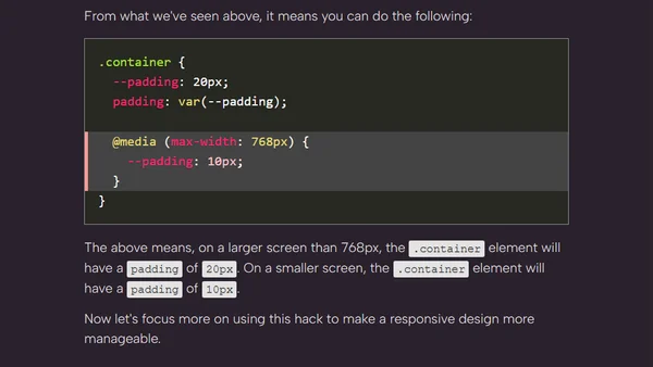
Using CSS Media Queries and Variables for Responsiveness
Read OriginalThis technical article explains a method for simplifying responsive web design by combining CSS media queries with CSS custom properties (variables). It demonstrates how to override variable values within media queries to dynamically adjust styles like padding, grid columns, and font sizes based on screen size, making the code more maintainable.
0 comments
Comments
No comments yet
Be the first to share your thoughts!
Browser Extension
Get instant access to AllDevBlogs from your browser
Top of the Week
No top articles yet