The Art of Amiga lettering
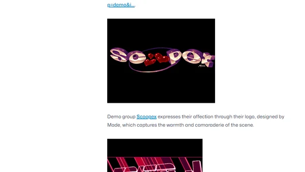
Read OriginalThis article showcases and analyzes the remarkable hand-crafted typography and lettering art from the Amiga computer era, highlighting title screens, demo group logos, and publisher branding from games like Falcon and studios like Psygnosis. It celebrates the pixel-art techniques and creative spirit of the demo scene, focusing on the visual design and artistic details achieved within technical constraints.
0 comments
Comments
No comments yet
Be the first to share your thoughts!
Browser Extension
Get instant access to AllDevBlogs from your browser
Top of the Week
1
Fix your upgrades and migrations with Codemods
Cassidy Williams
•
2 votes
2
Designing Design Systems
TkDodo Dominik Dorfmeister
•
2 votes
3
A simple explanation of the big idea behind public key cryptography
Richard Gendal Brown
•
2 votes
4
Introducing RSC Explorer
Dan Abramov
•
1 votes
5
The Pulse: Cloudflare’s latest outage proves dangers of global configuration changes (again)
The Pragmatic Engineer Gergely Orosz
•
1 votes
6
Fragments Dec 11
Martin Fowler
•
1 votes
7
Adding Type Hints to my Blog
Daniel Feldroy
•
1 votes
8
Refactoring English: Month 12
Michael Lynch
•
1 votes
9
Converting HTTP Header Values To UTF-8 In ColdFusion
Ben Nadel
•
1 votes
10
Pausing a CSS animation with getAnimations()
Cassidy Williams
•
1 votes