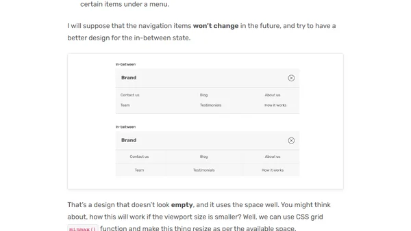
Thinking About The In-between Design Cases
Read OriginalThis article discusses the common problem in responsive web design where components look awkward on screen sizes between standard mobile and desktop breakpoints. It explains the causes, provides visual examples of 'in-between' design failures, and suggests solutions focused on better use of media queries and container sizing to improve the user experience across all viewports.
0 comments
Comments
No comments yet
Be the first to share your thoughts!
Browser Extension
Get instant access to AllDevBlogs from your browser
Top of the Week
No top articles yet