Media Queries Range Syntax
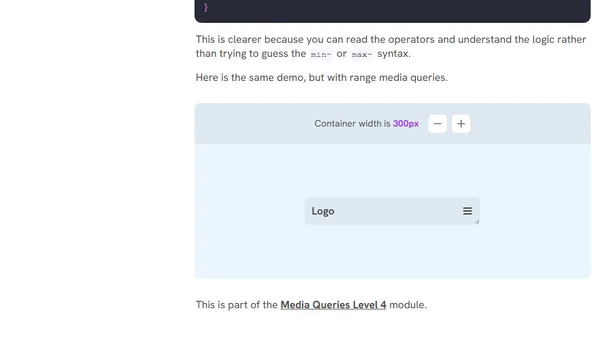
Read OriginalThis article discusses the confusion and layout bugs caused by using traditional min-width and max-width media queries with the same breakpoint value. It demonstrates a common navigation pattern where both elements become hidden at 300px. The solution is to use media query ranges from the Media Queries Level 4 specification, which employ comparison operators like <= and > for more readable and accurate breakpoints. The article highlights readability benefits and easier debugging, making a strong case for adopting range syntax in responsive CSS.
Comments
No comments yet
Be the first to share your thoughts!
Browser Extension
Get instant access to AllDevBlogs from your browser
Top of the Week
No top articles yet